
THE MASS ARCHIVE CHIZHAI
CHIZHAI! Asian-Vegan Food.
A Fresh Identity For A New Way To Eat.
MASS Role
MASS created a complete brand direction for ChiZhai!, translating an Asian-vegan food concept into a distinctive identity with the energy and flexibility to work across takeaway, delivery, digital ordering and restaurant environments.
Starting with the meaning behind the ChiZhai! name, the project developed a bold logo, colour palette and typographic style before demonstrating how the identity could live across packaging, storefronts, interiors and online platforms.
Client
ChiZhai!
Delivery
Brand Strategy · Brand Identity · Logo Design Creative Direction · Typography · Colour Palette Packaging Concepts · Digital Applications Environmental Graphics
The Challenge
ChiZhai! brought together two increasingly popular areas of food culture: Asian cuisine and vegan dining.
The business needed an identity that could communicate both elements clearly while feeling contemporary, distinctive and accessible to a broad audience.
Although the ChiZhai! name had an authentic meaning, it was unfamiliar to many UK customers. The brand therefore needed to make the name memorable and understandable without losing the cultural thinking behind it.
The challenge was to avoid the familiar visual clichés associated with traditional Asian restaurants, as well as the softer and more predictable natural styling commonly used by vegan food brands.
The identity needed to feel energetic, urban and modern while still communicating freshness and the plant-based character of the food.
It also had to remain clear and recognisable across very different applications, from compact food-ordering listings and takeaway packaging to prominent exterior signage and restaurant interiors.
The Idea
The creative direction grew directly from the meaning behind the ChiZhai! name.
“Chi” means to eat or consume, while “Zhai” refers to abstaining from meat or following a vegetarian diet. These Chinese characters became a central part of the identity, connecting the contemporary brand with the meaning behind its name.
The characters were combined with a bold, forward-leaning wordmark and an energetic exclamation mark, giving the identity a strong sense of movement and personality.
A vivid lime and green colour palette communicated freshness, plant-based ingredients and positive energy. Deep charcoal provided contrast and introduced a more confident, urban quality.
Rather than relying on decorative cultural references, the resulting identity created a clear visual bridge between modern Asian food, vegan dining and the fast-moving takeaway market.
The Work
MASS developed a complete suite of primary and secondary ChiZhai! logos, including full-colour and monochrome versions for use across light and dark backgrounds.
A distinctive typographic system and focused colour palette were established to give the brand consistency while retaining its energetic personality.
The identity was then explored across a range of practical customer touchpoints.
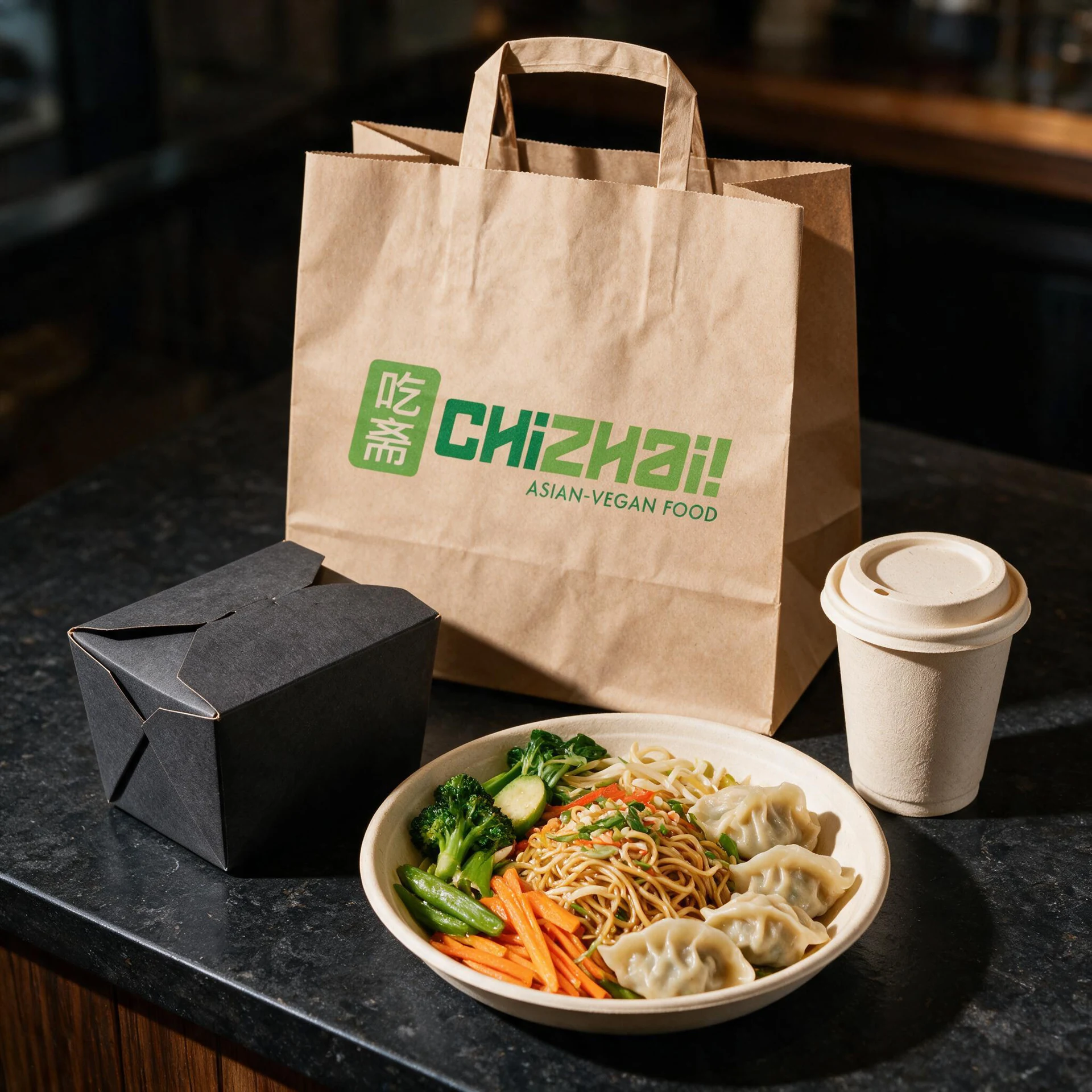
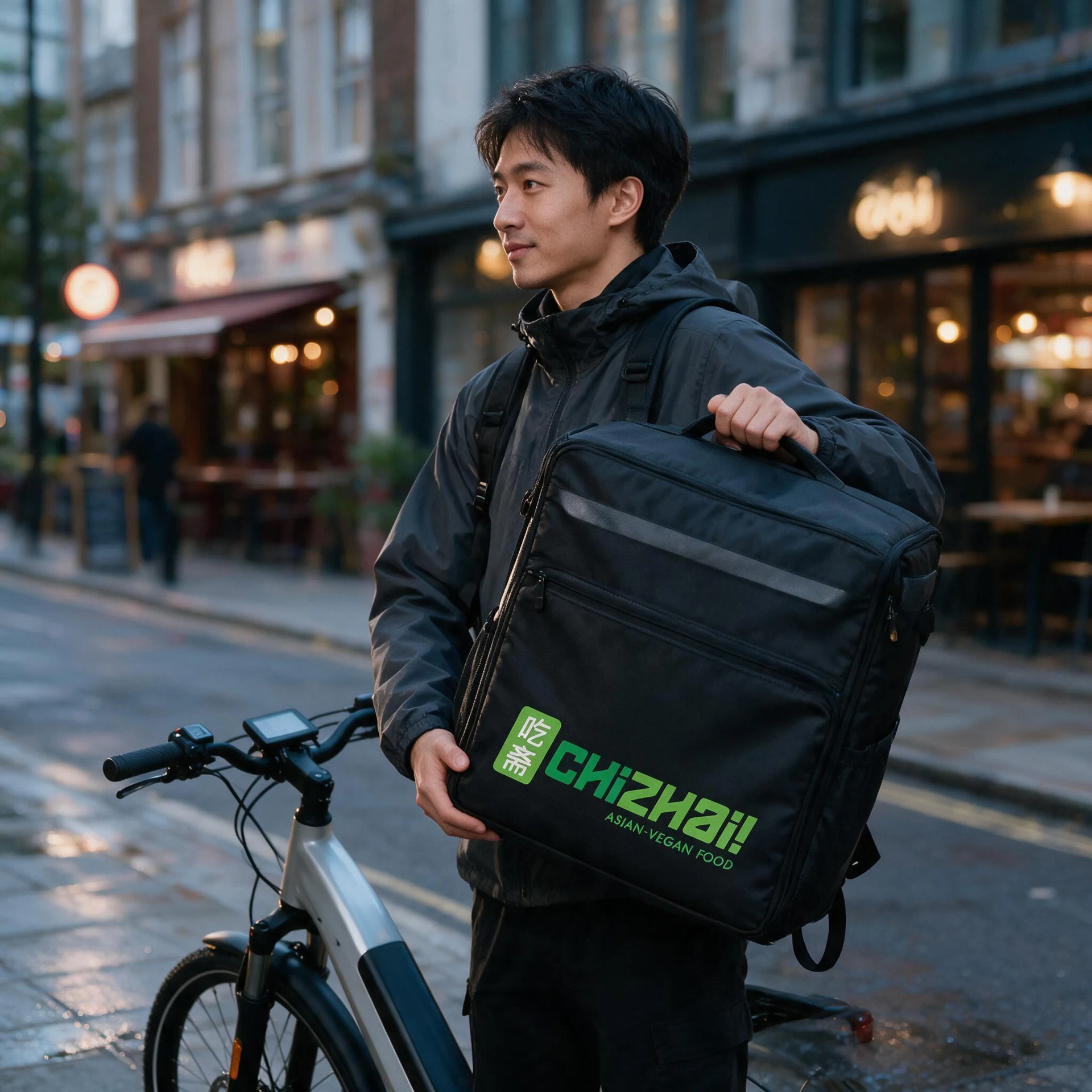
Packaging applications included branded paper takeaway bags and food containers, showing how the vivid green identity could create immediate recognition against simple kraft and charcoal materials.
Digital concepts demonstrated how the brand could work within online food-ordering platforms, where the identity needed to remain clear and recognisable at a much smaller scale.
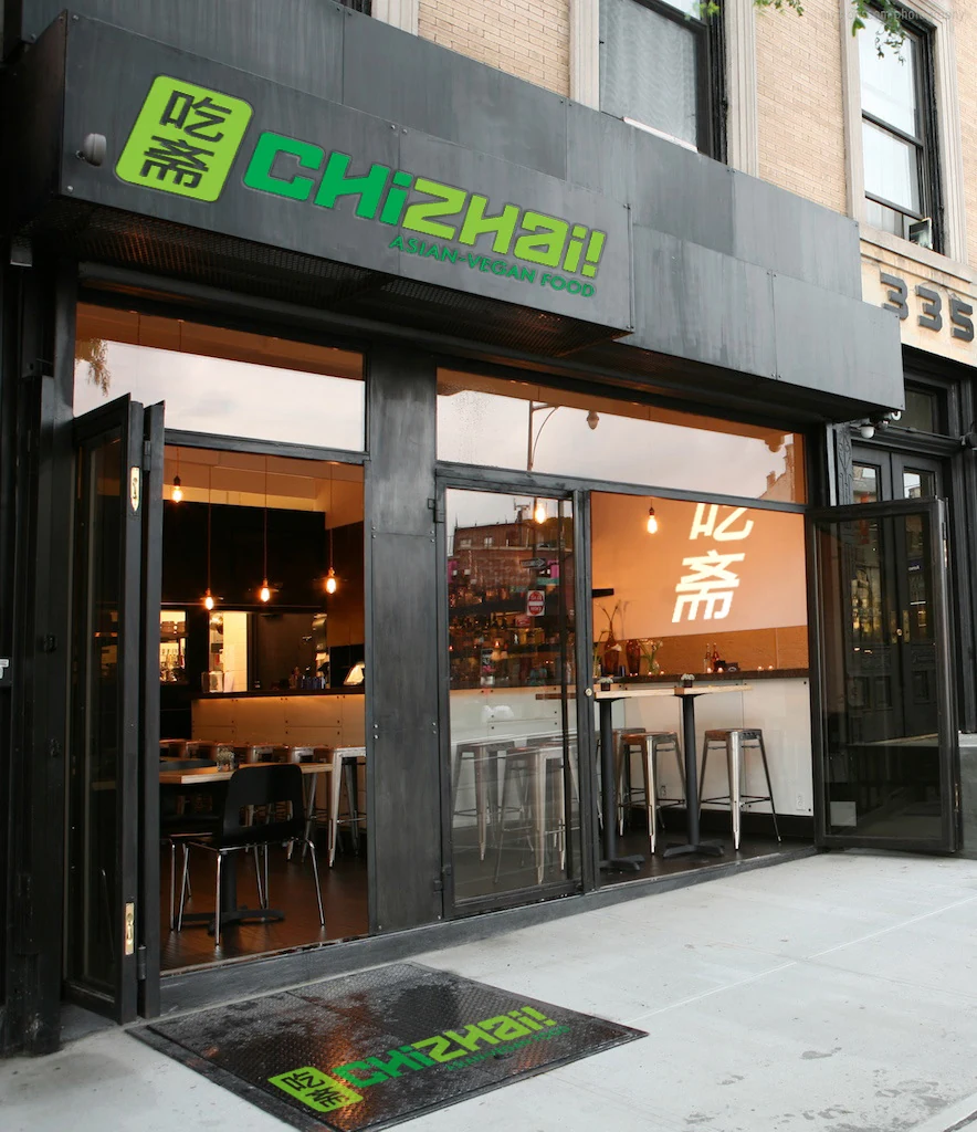
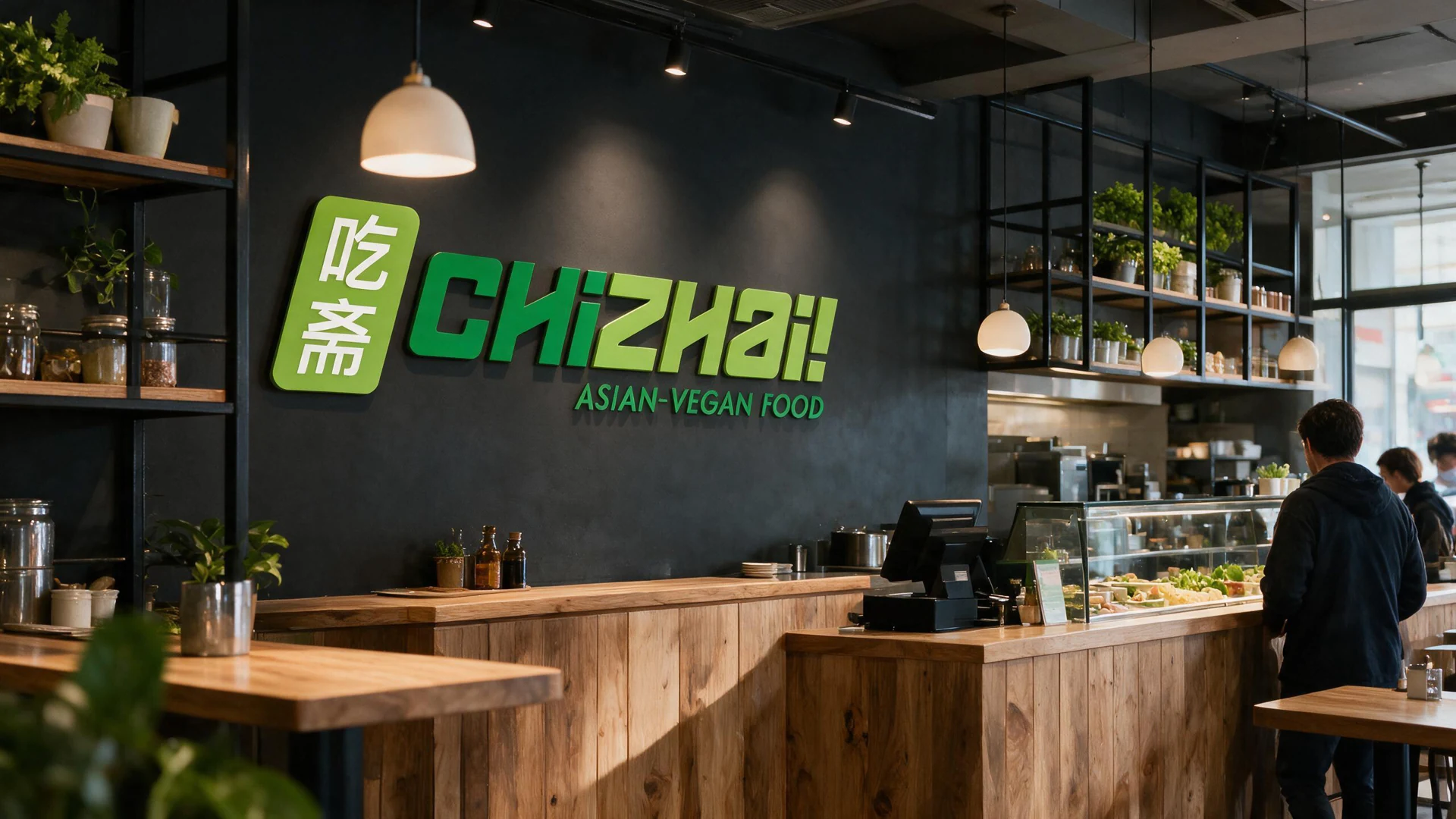
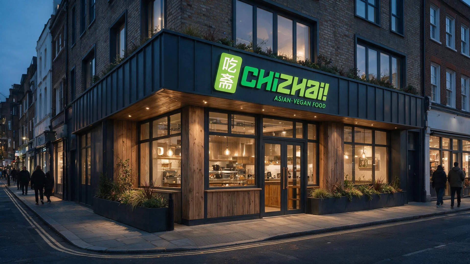
Exterior signage, window applications and entrance graphics gave ChiZhai! a bold street presence, while interior branding showed how the same visual language could carry through into the restaurant environment.
Together, these applications demonstrated how the identity could create one consistent experience, from discovering ChiZhai! online to receiving an order or visiting the restaurant.
The Result
The resulting identity gave ChiZhai! a bold and memorable personality that brought together Asian food culture and contemporary vegan dining.
The distinctive combination of Chinese characters, energetic typography and vivid green colours helped the brand avoid the predictable styling associated with both traditional Asian restaurants and conventional plant-based businesses.
The completed system remained recognisable across packaging, ordering platforms, signage and interiors, giving every customer touchpoint a consistent visual character.
ChiZhai! had a flexible brand foundation capable of supporting a modern takeaway, delivery and restaurant experience while providing plenty of scope for future development.
Client Response
“MASS understood that ChiZhai! needed to feel modern and energetic while retaining a meaningful connection to the thinking behind the name.
The identity brought those elements together brilliantly. It was bold enough to stand out on a storefront or food-ordering platform while remaining flexible across packaging, interiors and every other customer touchpoint.
The work gave ChiZhai! a distinctive personality and a clear visual foundation from which the concept could grow.”
Adrian Lea Owner ChiZhai!