
THE MASS ARCHIVE MEISHI
Meishi Taste of Southeast Asia. A Vibrant Identity With Flavour Built In.
MASS Role
MASS created a complete brand identity for Meishi, transforming a contemporary Southeast Asian food concept into a distinctive and energetic customer-facing brand.
Beginning with the meaning behind the Meishi name, MASS developed the logo, typography and colour palette before demonstrating how the identity could work across takeaway packaging, staff clothing, digital ordering and restaurant environments.
Client
Meishi
Delivery
Brand Strategy · Brand Identity · Logo Design Creative Direction · Typography · Colour Palette Packaging Concepts · Digital Ordering · Branded Clothing Restaurant Interiors · Exterior Signage
The Challenge
Meishi was conceived as a contemporary food brand celebrating the flavours and culinary culture of Southeast Asia.
The business required an identity capable of expressing the freshness, energy and intensity of its food while remaining accessible to customers unfamiliar with the Meishi name.
The name had an authentic and relevant meaning, but its pronunciation and significance would not necessarily be immediately understood by a UK audience. The identity therefore needed to make Meishi memorable while providing a meaningful connection to the food behind the brand.
The creative approach also needed to avoid the familiar visual clichés often associated with Asian restaurants. It had to feel expressive and culturally relevant without becoming traditional, decorative or predictable.
Finally, the identity needed sufficient flexibility to work across numerous customer touchpoints—from small food-ordering listings and takeaway containers to clothing, illuminated signs and complete restaurant environments.
The Idea
The creative direction began with the meaning of Meishi.
Pronounced “MAY-SHE”, the name is derived from the Chinese characters 美食, meaning culinary delicacy, fine food or gourmet food.
This provided a strong foundation for an identity centred on the quality, flavour and enjoyment of Southeast Asian cuisine.
MASS created an expressive brush-painted wordmark that felt spontaneous, energetic and handmade. Its natural texture suggested freshly prepared food while giving Meishi a bold and immediately recognisable personality.
The vibrant colour palette moved through orange, pink and deep magenta, reflecting heat, spice, freshness and the variety of flavours found throughout Southeast Asia. Black and neutral tones provided contrast, allowing the brighter colours to become the distinctive signature of the brand.
The understated line “taste of southeast asia” completed the identity, clearly communicating the offer while balancing the expressive character of the Meishi wordmark.
The Work
MASS developed the Meishi concept into a complete and adaptable visual identity.
The primary logo combined the expressive brush-painted wordmark with the “taste of southeast asia” positioning line. A coordinated suite of secondary and monochrome versions ensured the identity could work effectively across light, dark and coloured backgrounds.
The brush-style Levi ReBrushed typeface carried the energy of the logo into prominent brand messaging, while Courier introduced a simple, functional contrast for supporting information.
A distinctive five-colour palette was established, combining vivid orange, pink and magenta with black and soft grey. This gave the identity variety while maintaining a consistent visual character across every application.
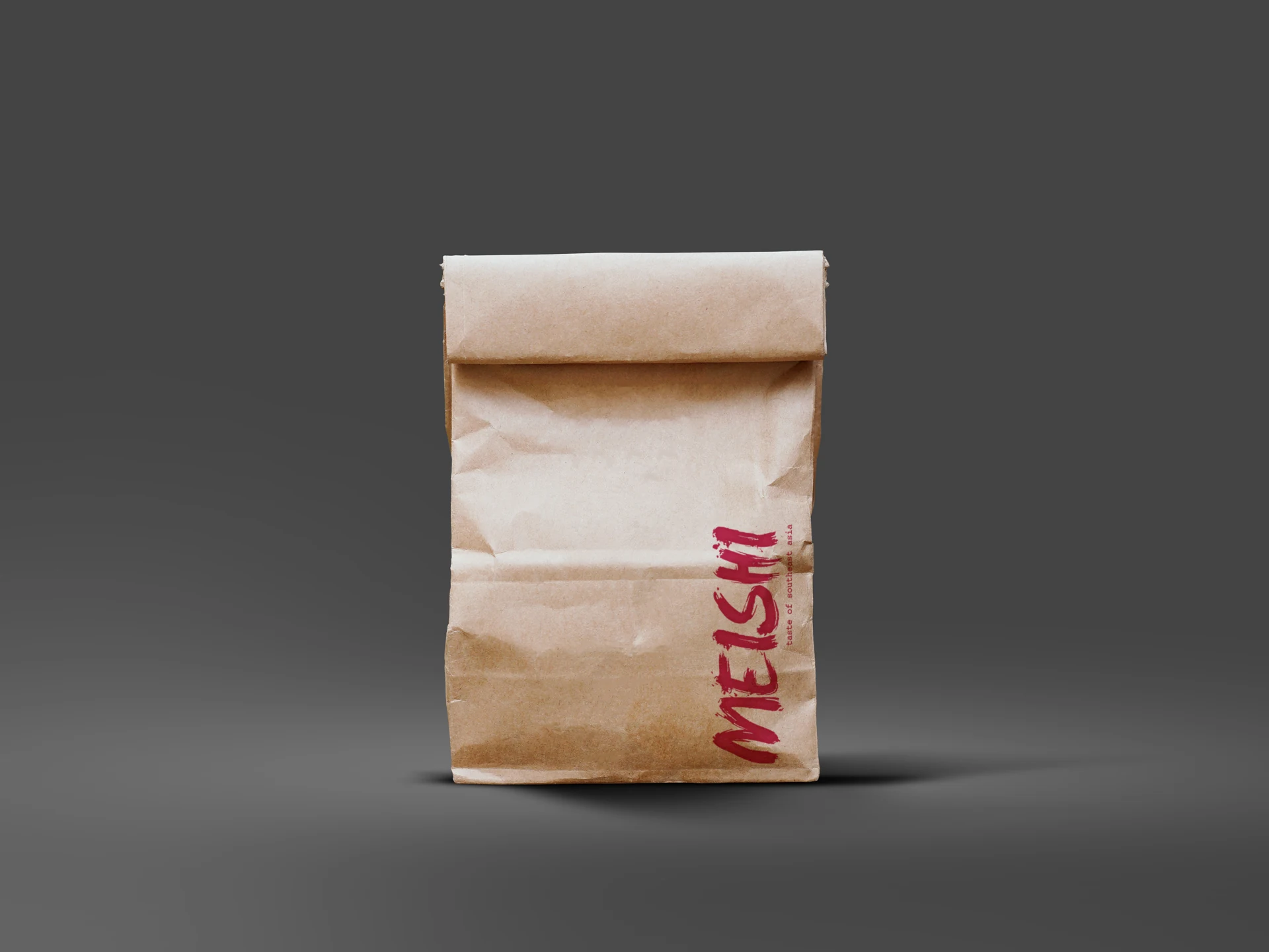
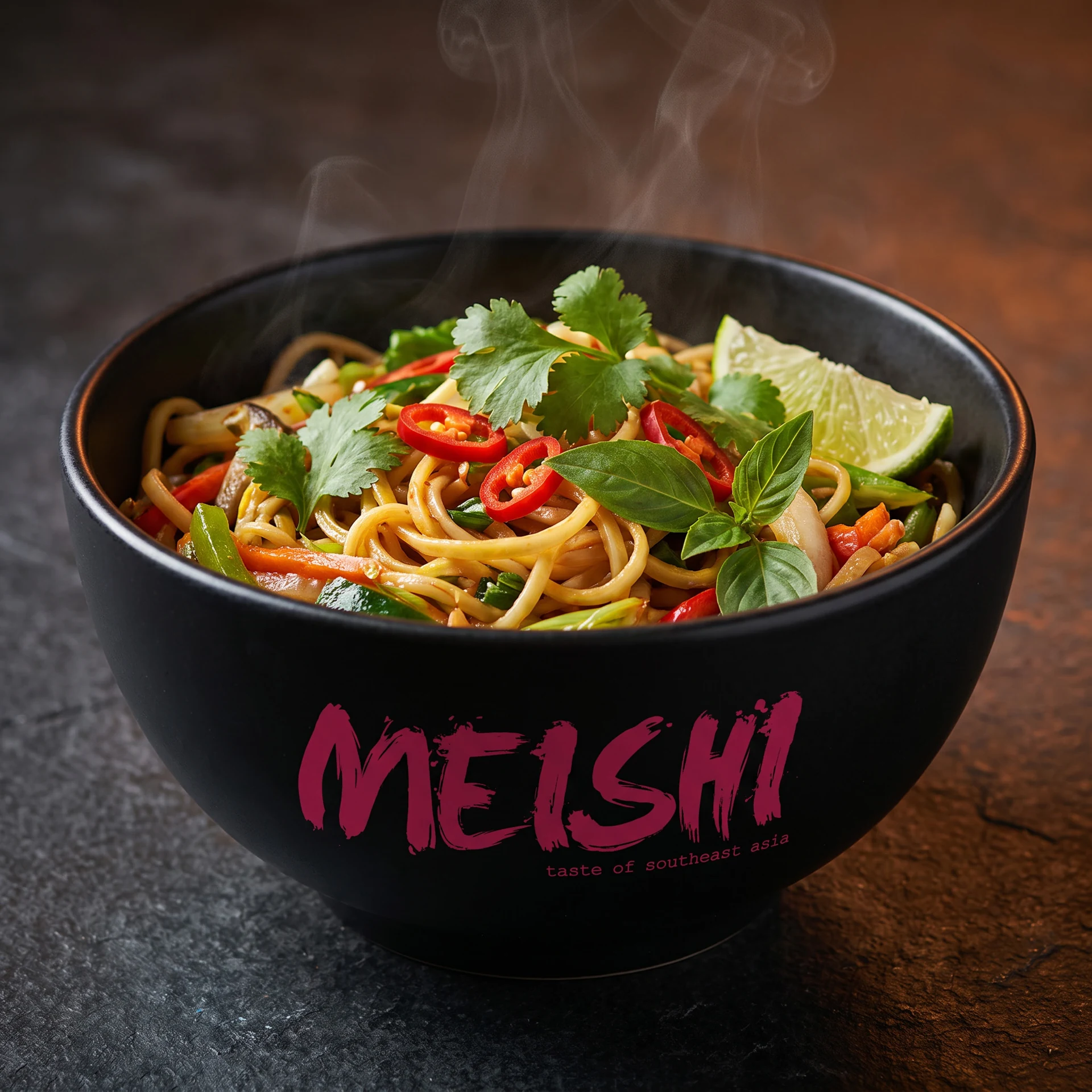
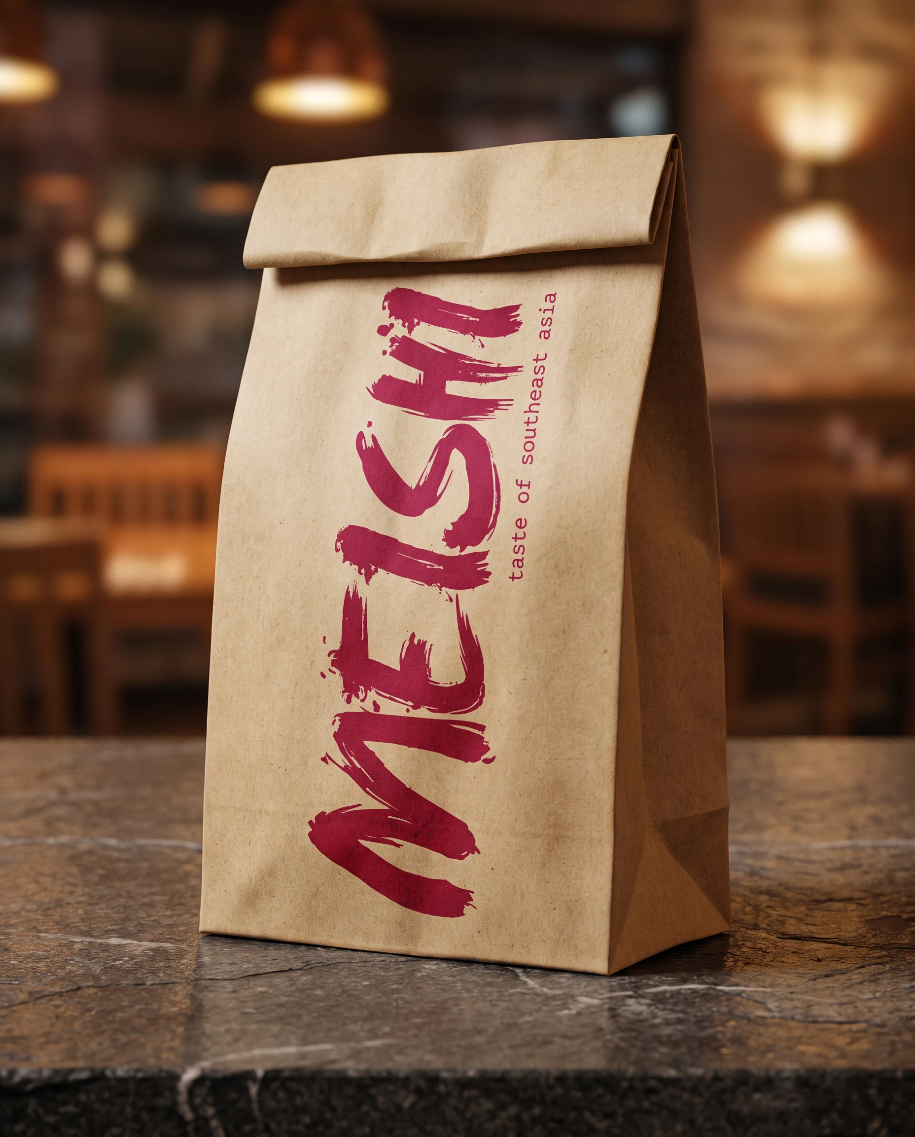
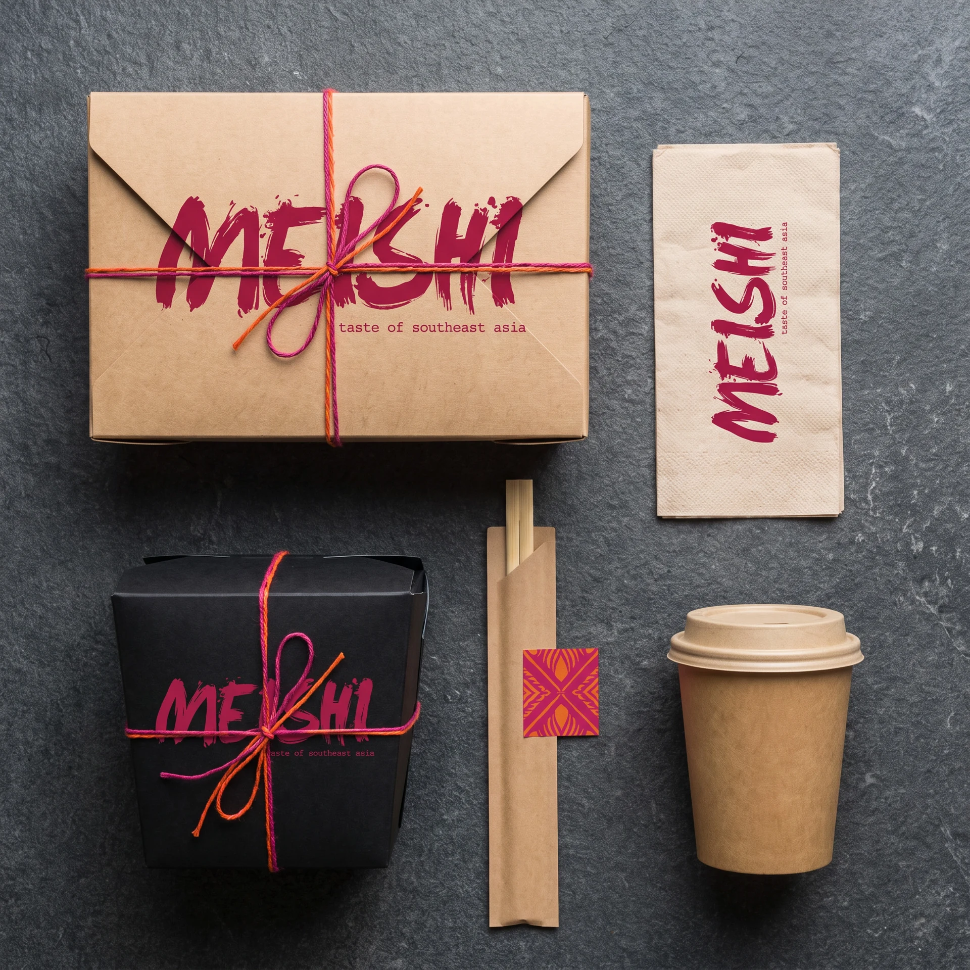
Packaging concepts demonstrated how the branding could work across kraft-paper takeaway bags and food containers. The contrast between natural packaging materials and the vivid Meishi colour palette created a contemporary, handcrafted appearance.
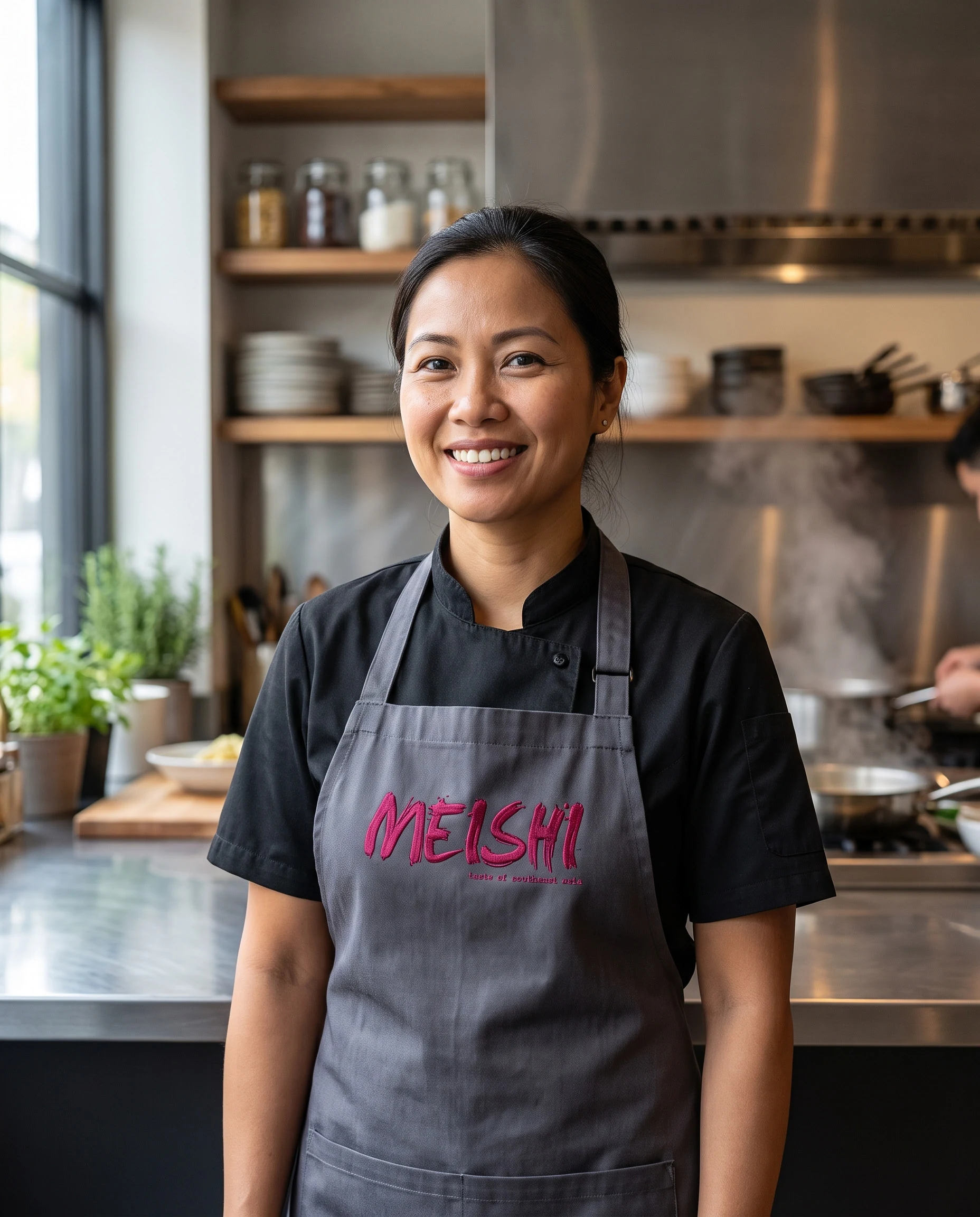
Branded clothing showed how the identity could be applied simply and confidently to restaurant uniforms and merchandise.
Digital concepts explored Meishi within an online food-ordering platform, where the logo, food photography and supporting information needed to remain clear and engaging at a much smaller scale.
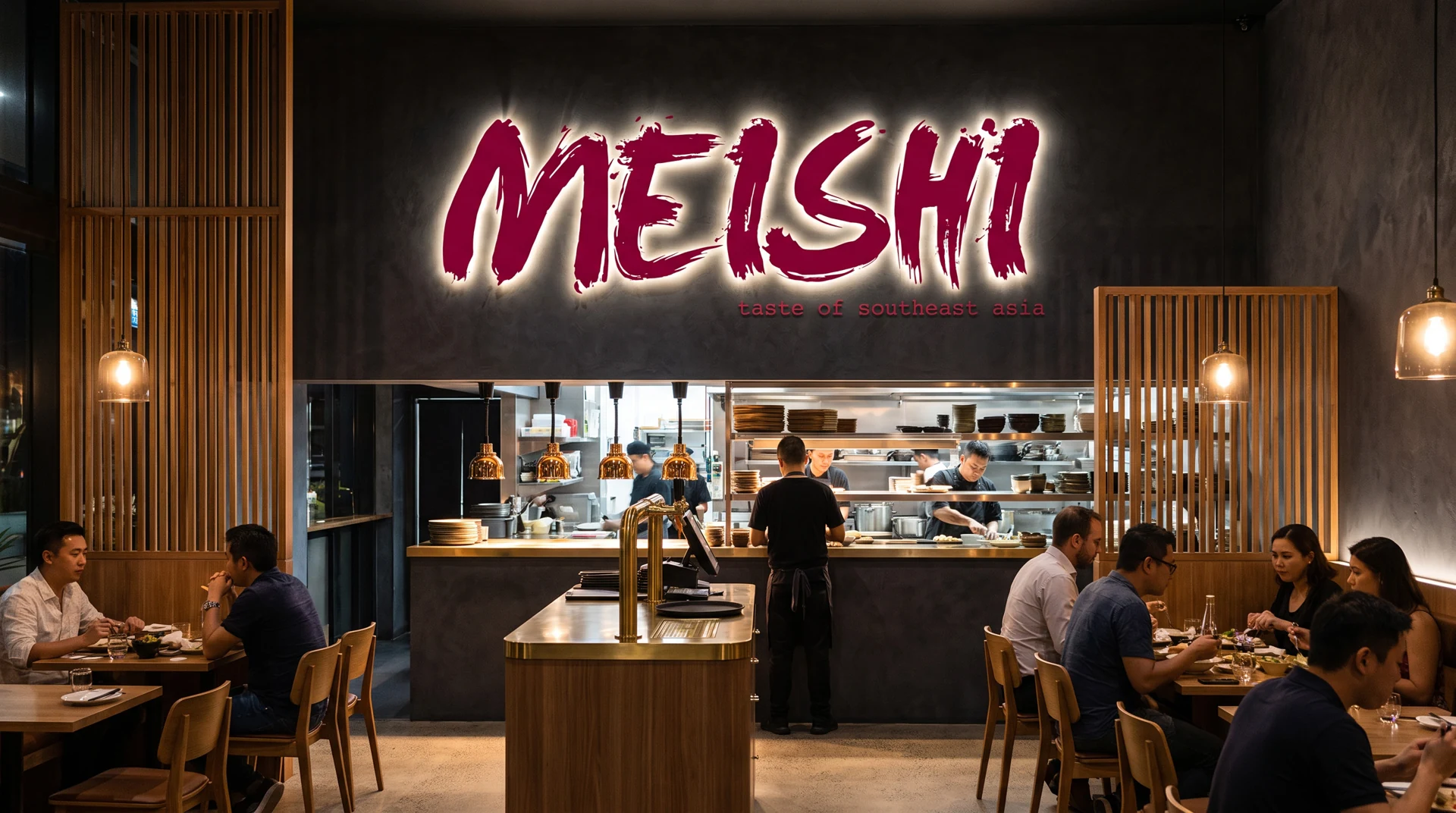
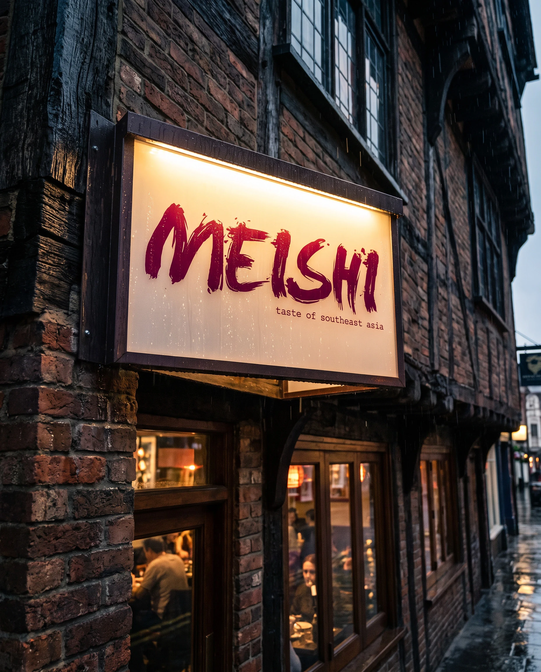
Exterior signage gave the restaurant a bold and highly visible street presence, while the interior application demonstrated how illuminated Meishi branding could sit comfortably within a darker, more atmospheric dining environment.
Together, these applications created one coherent brand experience—from discovering Meishi online and receiving a takeaway order to entering and dining within the restaurant itself.
The Result
The completed identity gave Meishi a distinctive and energetic personality rooted in the meaning behind its name and the flavours of Southeast Asian cuisine.
The expressive brush wordmark and vivid colour palette helped the brand move beyond conventional restaurant styling, creating an appearance that felt contemporary, confident and immediately recognisable.
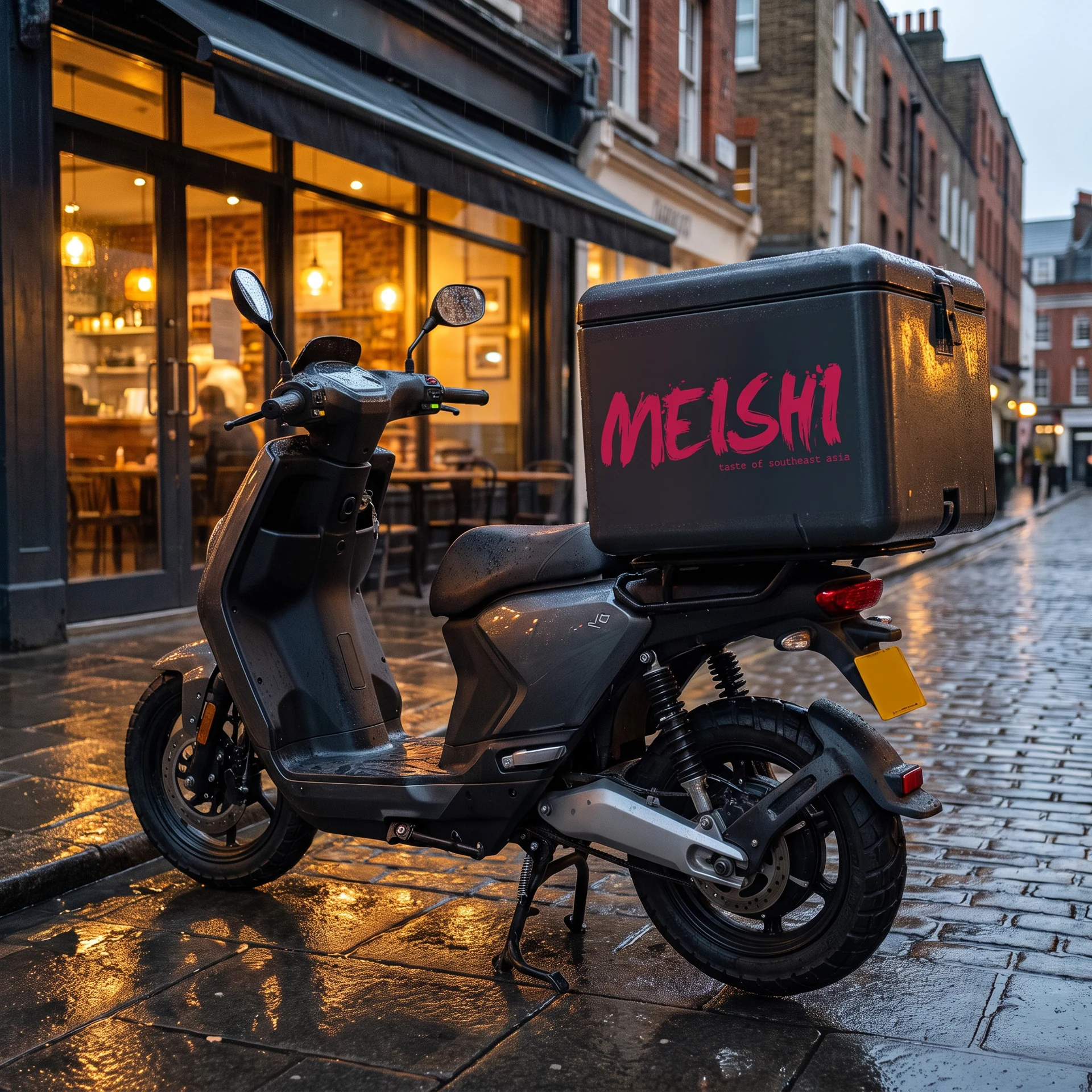
The identity retained its character across packaging, clothing, digital ordering, exterior signage and restaurant interiors, giving Meishi a flexible system suitable for every stage of the customer journey.
The project provided the business with a strong visual foundation capable of supporting takeaway, delivery and restaurant experiences while offering plenty of scope for future growth.
Client Response
“MASS took the original Meishi idea and created an identity that captured the energy, colour and flavour we wanted the brand to represent.
The meaning behind the name was translated into something contemporary and immediately recognisable, without relying on the predictable imagery often associated with Asian food brands.
The identity worked brilliantly across packaging, clothing, digital ordering and the restaurant environment, giving Meishi a strong and consistent personality at every customer touchpoint.”
Adrian Lea Owner Meishi!