
A brand doesn't need a new personality every time it has something new to say. More often, it needs a creative approach that makes the next campaign feel fresh without losing what people already recognise.
That was the thinking behind A Better Fit, our work with énergie Fitness. Working as an extension of énergie HQ, MASS developed and delivered campaign materials across print and digital environments while protecting the identity of an established fitness brand.
The challenge wasn't a lack of ideas
énergie Fitness needed a smarter way to communicate activities, offers and experiences across its club network. The creative had to work in different locations and formats, from a club poster to something a member might encounter online. Each new message needed room to stand out, but it still had to look and feel like énergie.
Changing the style with every campaign might have created momentary novelty. It would also have made the brand harder to recognise. The better route was a clear system that could accommodate different ideas.
One familiar device. Plenty of energy.
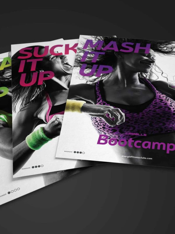
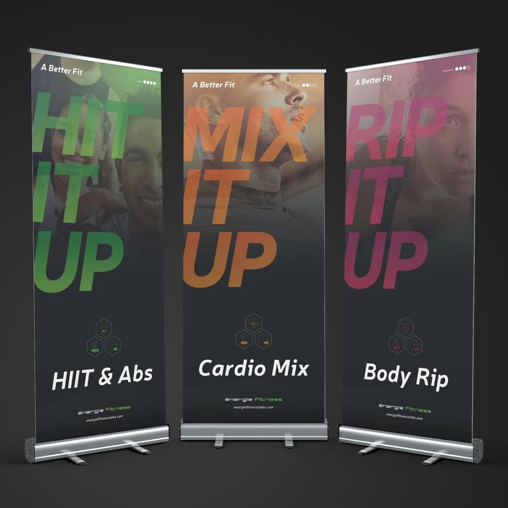
We developed a flexible campaign approach built around bold fitness photography, energetic headlines and the simple “It Up” naming device.
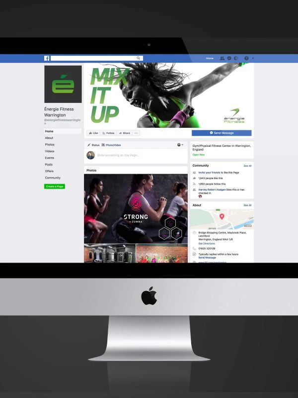
Step It Up. Pump It Up. Mix It Up. Each had its own attitude, colour and focus, but the relationship between typography, imagery and brand made the family instantly recognisable. Other campaigns, including Warm It Up and Tone It Up, extended the same approach into different messages.
The point was not to make five campaigns look identical. It was to make five different messages feel as though they belonged to the same brand.
Creative direction has to work beyond the hero image
The most attractive artwork isn't always the hardest part of a campaign. The real test is whether the idea survives its everyday applications.
Our work for énergie covered posters, leaflets, indoor displays, social media, promotional clothing and supporting digital assets. Each had its own constraints. A small promotional piece couldn't carry the same information as a club display, but the visual language still had to connect.
By learning the brand and working closely with the in-house team, MASS could deliver new materials without resetting the creative direction every time a fresh brief arrived.
The value of a recognisable campaign family
The result was a consistent and flexible suite of communications, helping énergie HQ and individual clubs present new campaigns while maintaining the established brand identity.
There's a wider lesson here for any organisation producing regular marketing content. Consistency is not the enemy of creativity. When the foundations are clear, creative teams can spend more time developing the message and less time reinventing the presentation.
Explore the original campaign artwork in the énergie Fitness MASS Archive. If your organisation needs a consistent creative approach across multiple campaigns, talk to MASS.