MASS

Hertfordshire Mavericks brand identity

THE MASS ARCHIVEMAVERICKSHertfordshireMavericksUpping The Game.A Stronger IdentityFor A Champion Team.MASS RoleMASS created a revitalised brand identity for Hertfordshire Mavericks, giving the women’s netball team a smarter, fresher and more confident visual presence.The identity was designed to reflect the Mavericks’ growing reputation while maintaining a clear connection with the University of Hertfordshire and establishing the team as a distinctive sporting brand in its own right.ClientUniversity of Hertfordshire Mavericks NetballDeliveryBrand Strategy · Brand Identity · Logo DesignCreative Direction · Kit and MerchandiseSports Equipment · Digital AssetsThe ChallengeHertfordshire Mavericks — or Mavs to their supporters — were a champion women’s netball team with an increasingly prominent profile.The existing identity no longer reflected the team’s ambition, competitive character or growing reputation. They needed a stronger and more professional brand that players could be proud to represent and supporters would immediately recognise.The new identity also needed to balance two important requirements: retaining a visible relationship with the University of Hertfordshire while giving the Mavericks an independent and iconic sporting identity.It had to perform across numerous applications, from player kits and merchandise to equipment, promotional materials and digital platforms.The IdeaThe creative direction centred on building a bold, energetic identity with the confidence and presence expected of a leading sports team.MASS developed a distinctive Mavericks logo that felt sharper, more contemporary and better suited to the pace and intensity of elite netball.The identity was designed to connect visually with the University of Hertfordshire while remaining strong enough to stand independently. This gave the team an ownable sporting symbol rather than an identity that felt secondary to its principal sponsor.A confident graphic style helped communicate movement, determination and competitive energy, creating a mark that would be equally recognisable on the court, throughout the venue and across digital communications.The WorkMASS developed the refreshed Mavericks identity from its initial creative concept through to its application across the wider brand.The new logo was carefully constructed to provide a clear and memorable focal point, supported by a flexible visual approach that could work across physical and digital environments.The identity was rolled out across player jerseys, teamwear, caps and supporting merchandise. Branded netballs, water bottles and other equipment helped carry the Mavericks identity directly onto the court and into the matchday environment.The stronger visual system also provided the team with a consistent foundation for promotional graphics, supporter communications and digital assets.Every application was designed to feel part of the same confident sporting brand, whether the logo appeared prominently across a player’s kit or at a much smaller scale on merchandise and online content.The ResultHertfordshire Mavericks gained a smarter, fresher identity that successfully matched the team’s growing profile and competitive reputation.The new logo created a clear connection with the University of Hertfordshire while giving the Mavericks a distinctive and recognisable brand of their own.The identity was successfully introduced across team kits, equipment, merchandise and digital assets, creating a consistent visual presence wherever players and supporters encountered the club.Feedback from both supporters and players was extremely positive, with the new Mavericks logo regarded as one of the strongest identities within the Netball Superleague.Client Response“Working with the team to produce the new Hertfordshire Mavericks logo was a pleasure and the end result in terms of the new brand identity they created is exceptional.The Hertfordshire Mavericks logo is one of the strongest in the Netball Superleague and the way it linked to the main sponsor, the University of Hertfordshire, whilst being a separate iconic brand works incredibly well.We regularly receive feedback about how much supporters and players love the logo and we are very happy with the way MASS went about this project.I would have no hesitation in recommending MASS to anyone looking to refresh an existing or create a new brand identity.”David ConnellDirector of SportUniversity of Hertfordshire Sports Village
Mavericks project artwork

THE MASS ARCHIVE MAVERICKS
Mavericks project artwork

Hertfordshire Mavericks

Upping The Game. A Stronger Identity For A Champion Team.
Mavericks project artwork

MASS Role

MASS created a revitalised brand identity for Hertfordshire Mavericks, giving the women’s netball team a smarter, fresher and more confident visual presence.

The identity was designed to reflect the Mavericks’ growing reputation while maintaining a clear connection with the University of Hertfordshire and establishing the team as a distinctive sporting brand in its own right.

Client
Mavericks project artwork

University of Hertfordshire Mavericks Netball

Delivery

Brand Strategy · Brand Identity · Logo Design

Creative Direction · Kit and Merchandise

Sports Equipment · Digital Assets
Mavericks project artwork

The Challenge

Hertfordshire Mavericks — or Mavs to their supporters — were a champion women’s netball team with an increasingly prominent profile.

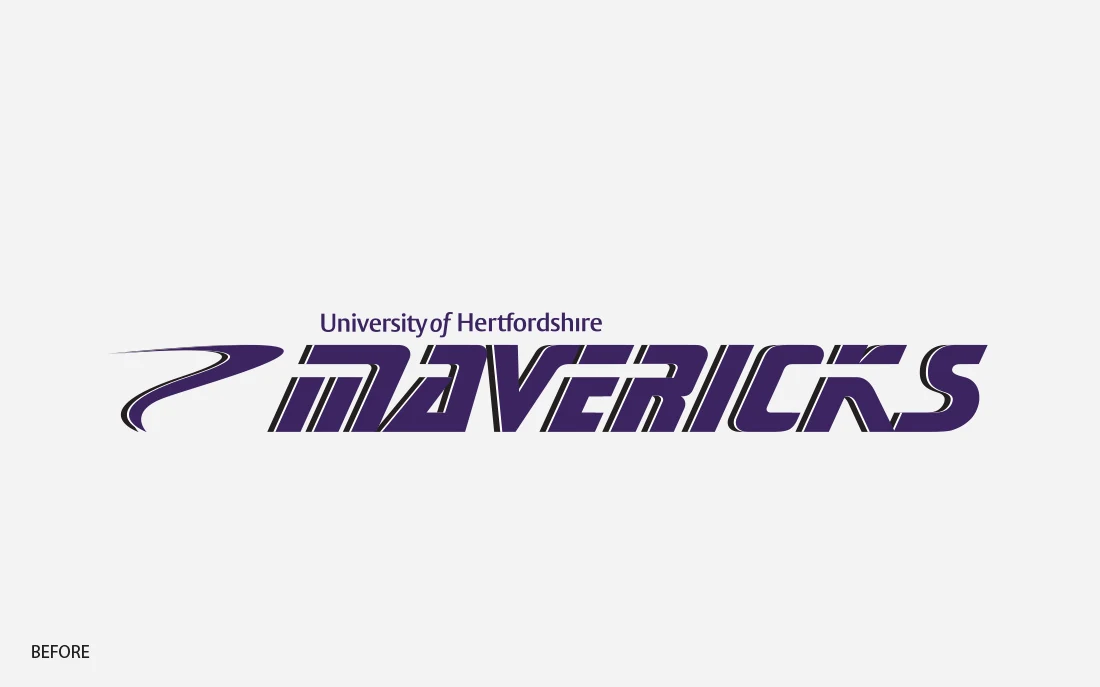
The existing identity no longer reflected the team’s ambition, competitive character or growing reputation. They needed a stronger and more professional brand that players could be proud to represent and supporters would immediately recognise.

The new identity also needed to balance two important requirements: retaining a visible relationship with the University of Hertfordshire while giving the Mavericks an independent and iconic sporting identity.

It had to perform across numerous applications, from player kits and merchandise to equipment, promotional materials and digital platforms.
Mavericks project artwork

The Idea

The creative direction centred on building a bold, energetic identity with the confidence and presence expected of a leading sports team.

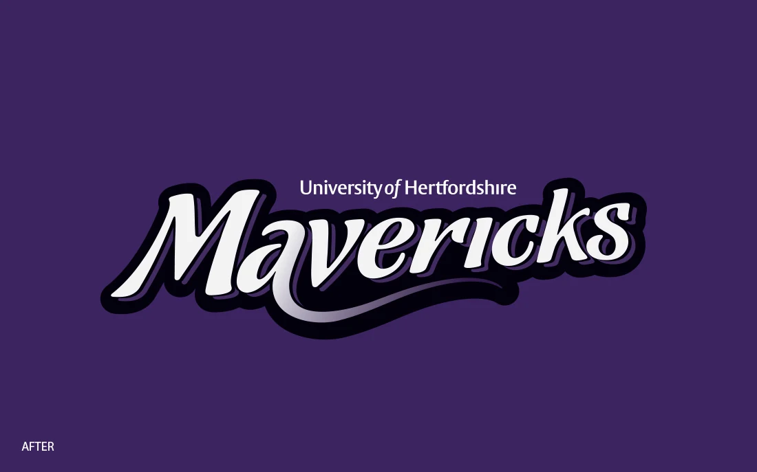
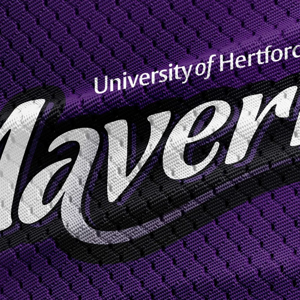
MASS developed a distinctive Mavericks logo that felt sharper, more contemporary and better suited to the pace and intensity of elite netball.

The identity was designed to connect visually with the University of Hertfordshire while remaining strong enough to stand independently. This gave the team an ownable sporting symbol rather than an identity that felt secondary to its principal sponsor.

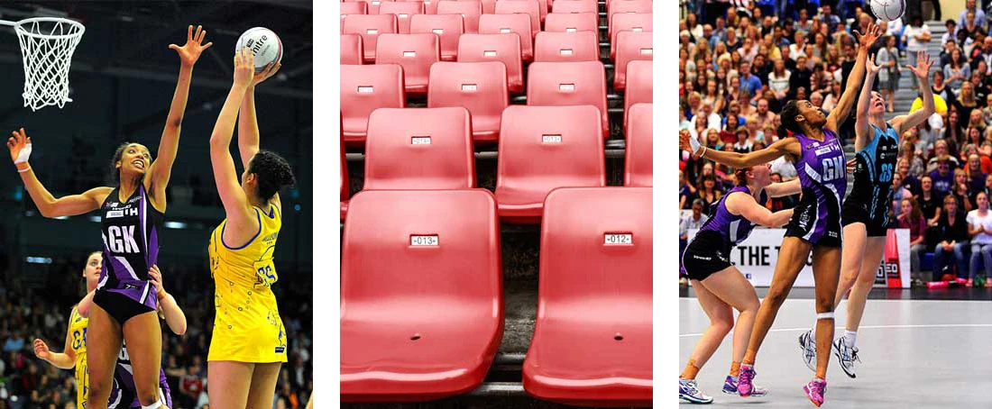
A confident graphic style helped communicate movement, determination and competitive energy, creating a mark that would be equally recognisable on the court, throughout the venue and across digital communications.
Mavericks project artwork

The Work

MASS developed the refreshed Mavericks identity from its initial creative concept through to its application across the wider brand.

The new logo was carefully constructed to provide a clear and memorable focal point, supported by a flexible visual approach that could work across physical and digital environments.

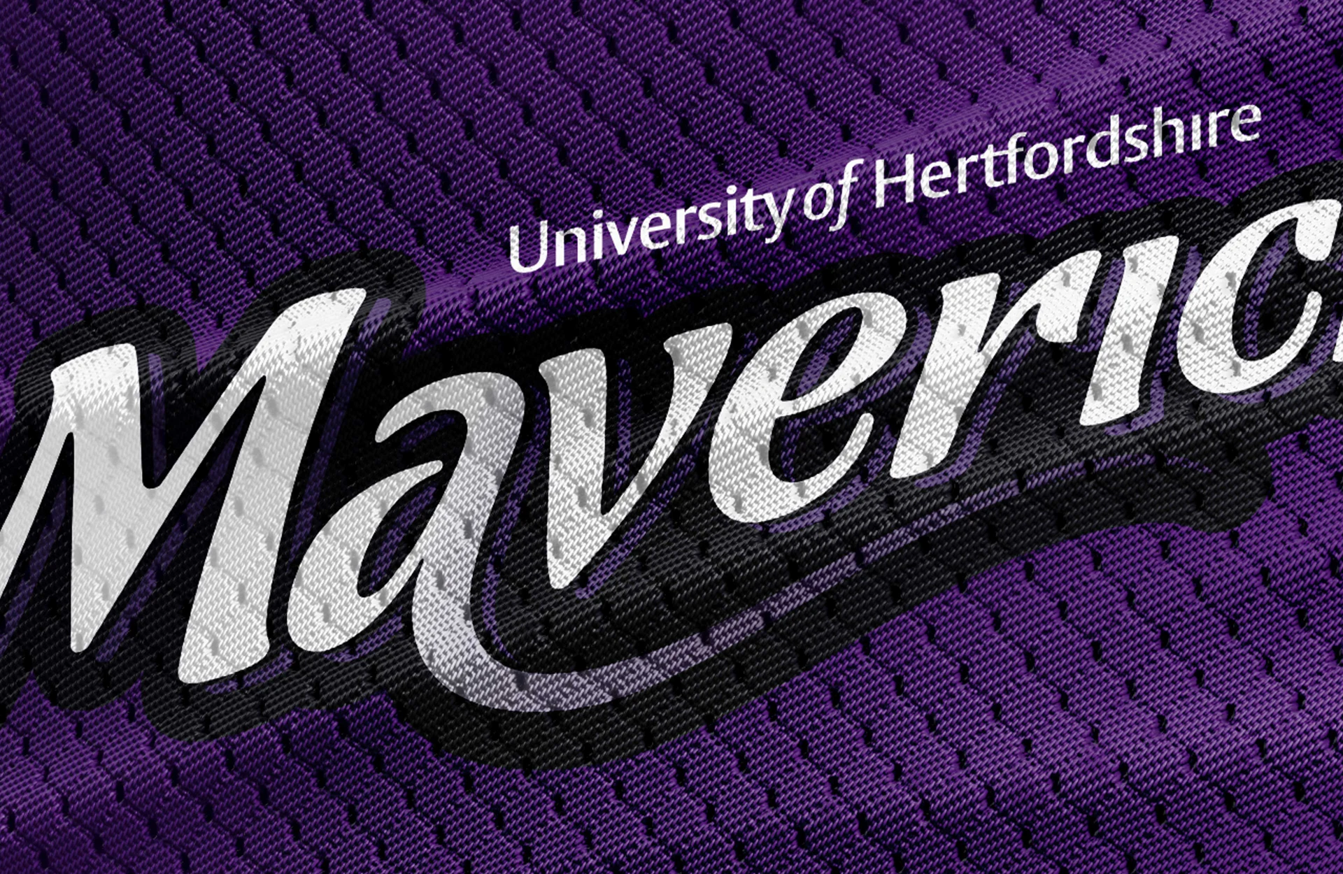
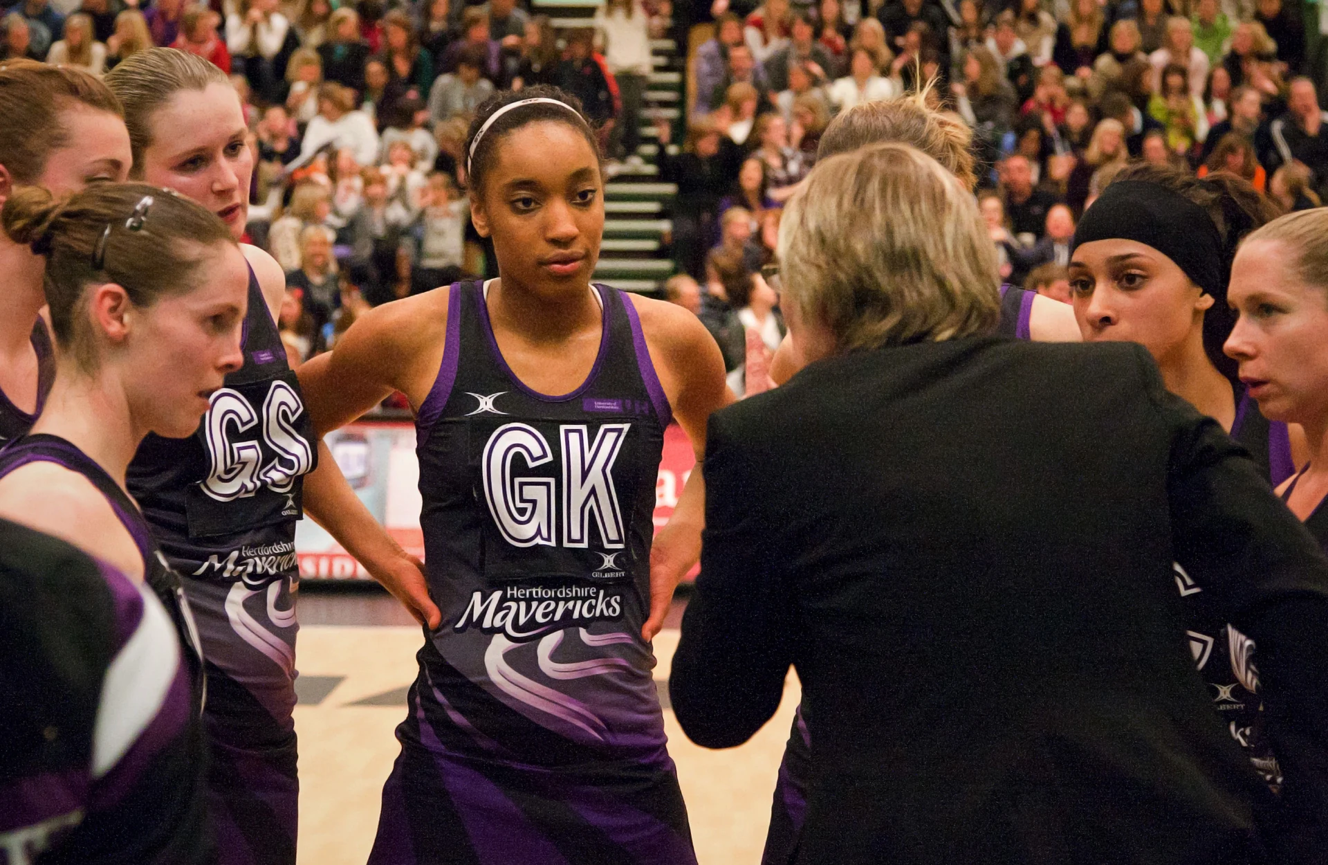
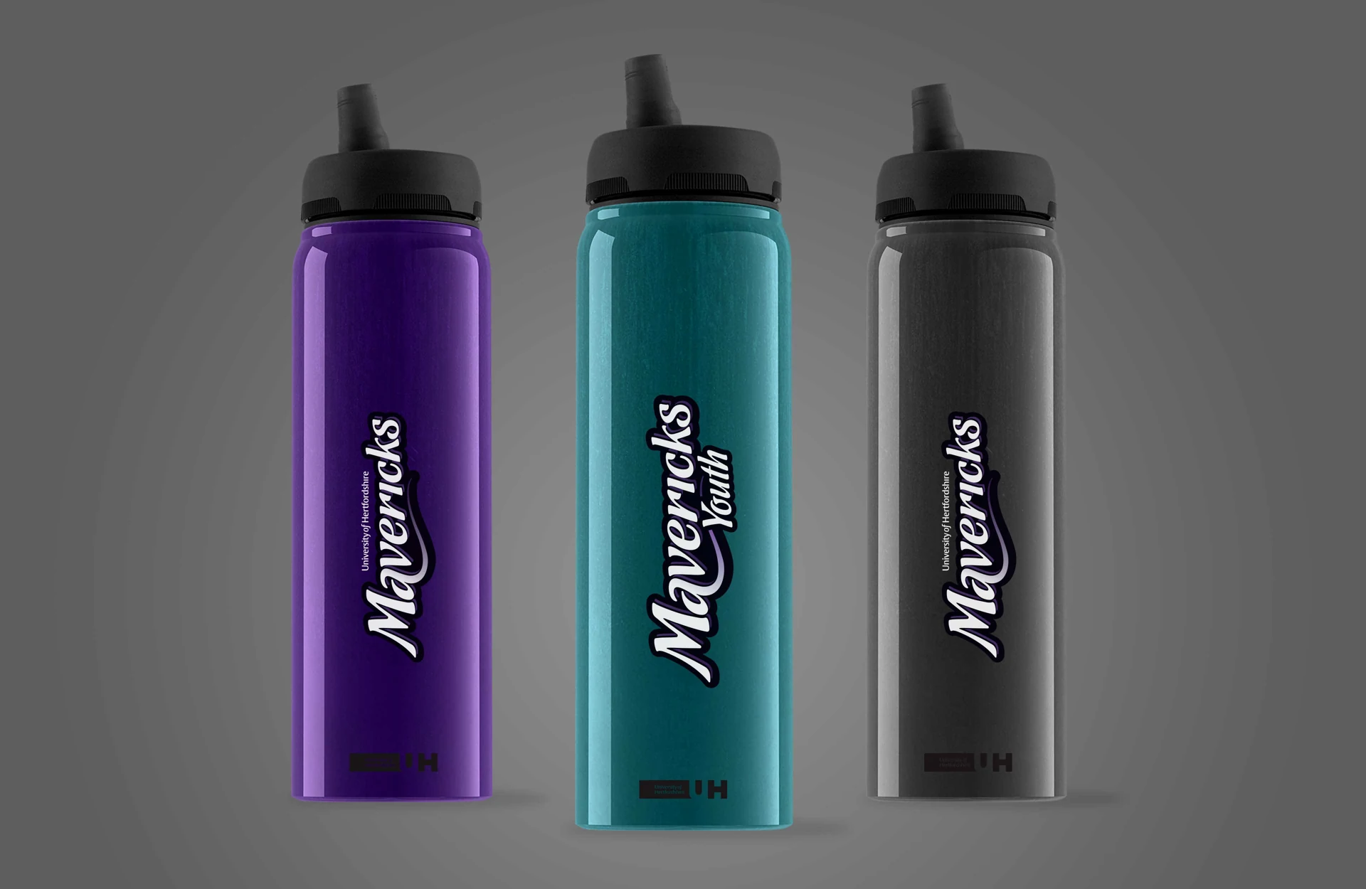
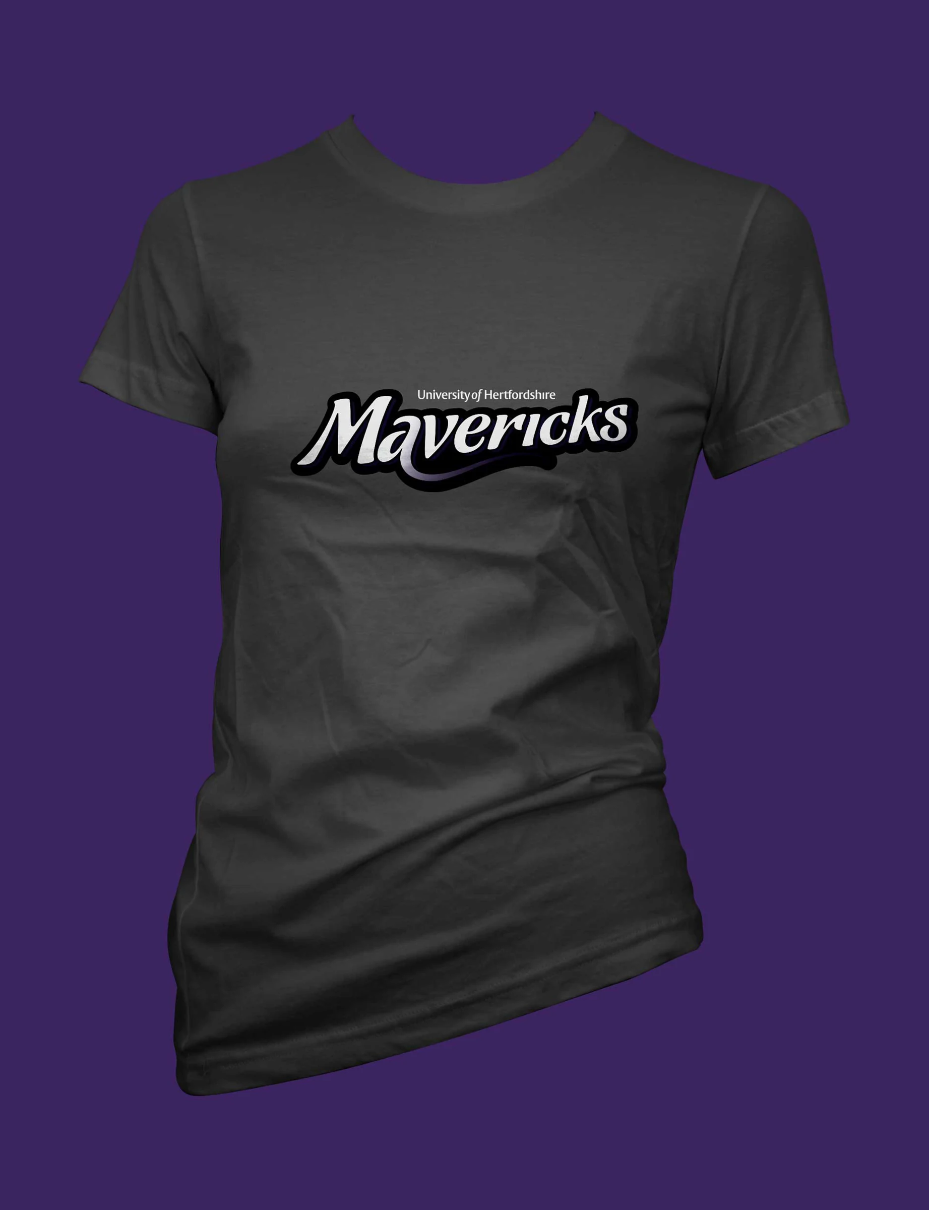
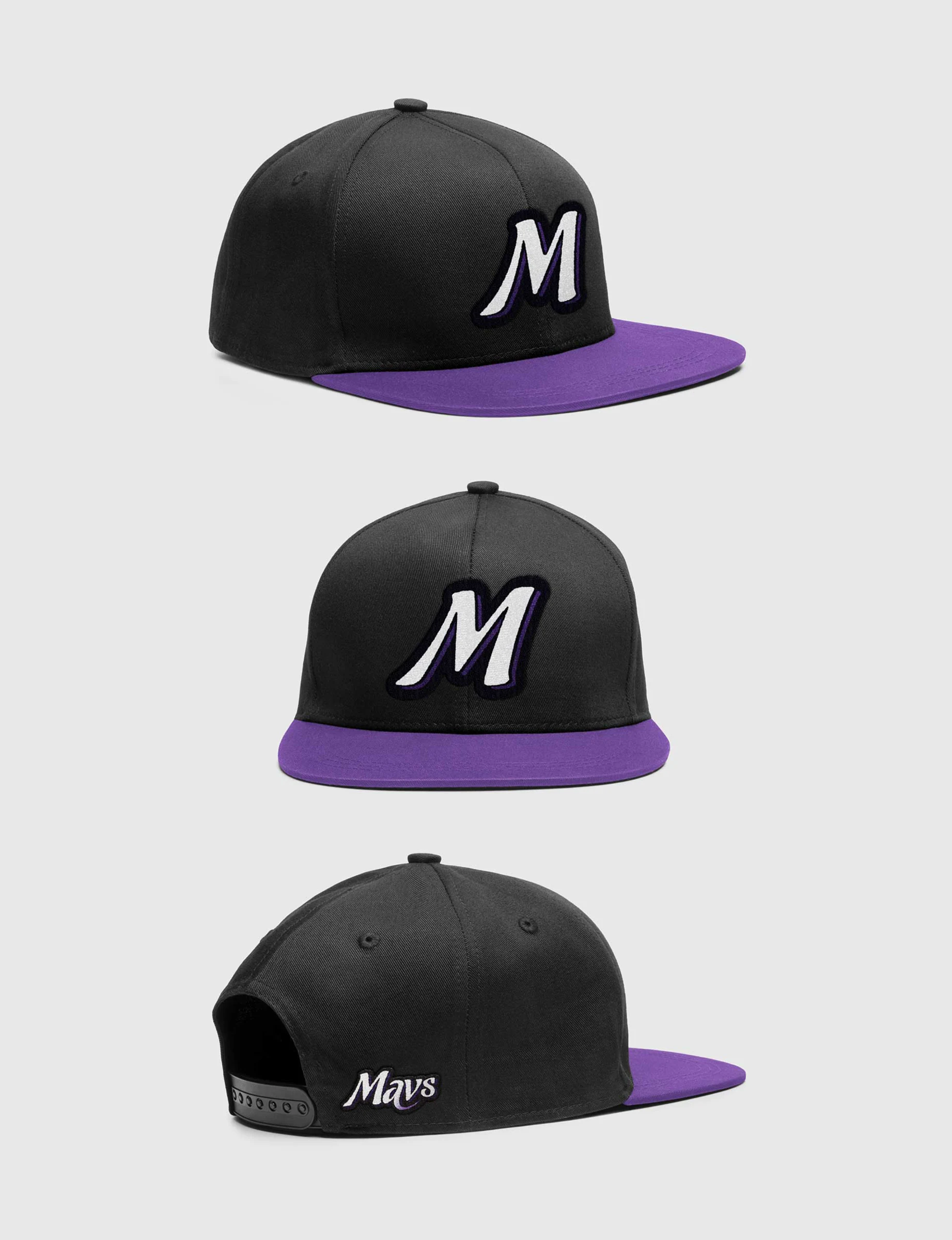
The identity was rolled out across player jerseys, teamwear, caps and supporting merchandise. Branded netballs, water bottles and other equipment helped carry the Mavericks identity directly onto the court and into the matchday environment.
Mavericks project artwork

The stronger visual system also provided the team with a consistent foundation for promotional graphics, supporter communications and digital assets.

Every application was designed to feel part of the same confident sporting brand, whether the logo appeared prominently across a player’s kit or at a much smaller scale on merchandise and online content.
Mavericks project artwork

The Result

Hertfordshire Mavericks gained a smarter, fresher identity that successfully matched the team’s growing profile and competitive reputation.

The new logo created a clear connection with the University of Hertfordshire while giving the Mavericks a distinctive and recognisable brand of their own.

The identity was successfully introduced across team kits, equipment, merchandise and digital assets, creating a consistent visual presence wherever players and supporters encountered the club.

Feedback from both supporters and players was extremely positive, with the new Mavericks logo regarded as one of the strongest identities within the Netball Superleague.
Mavericks project artwork

Client Response

“Working with the team to produce the new Hertfordshire Mavericks logo was a pleasure and the end result in terms of the new brand identity they created is exceptional.

The Hertfordshire Mavericks logo is one of the strongest in the Netball Superleague and the way it linked to the main sponsor, the University of Hertfordshire, whilst being a separate iconic brand works incredibly well.

We regularly receive feedback about how much supporters and players love the logo and we are very happy with the way MASS went about this project.

I would have no hesitation in recommending MASS to anyone looking to refresh an existing or create a new brand identity.”

David Connell Director of Sport University of Hertfordshire Sports Village