
CASE STUDIES SEDDON CONSTRUSTION
Seddon Construction, Foundation
Building an identity for equality, inclusion and positive change.
Client
Seddon Construction
Project
Foundation, Staff Gender Equality Group
Year
2018
Mass Role
· Creative Direction · Naming · Brand Identity · Art Direction · Brand Development
Delivery
· Identity System · Word Mark · Mission Statement · Colour Palette · Business Cards · Social Media · Motion Assets
The Context
Creating a distinct voice for positive change within the business.
Seddon Construction wanted to launch a staff group focused on greater gender equality and diversity.
The initiative needed an identity of its own, something employees could recognise, engage with and ultimately feel part of.
MASS was brought in to develop both the name and visual identity, creating a platform that could help the group establish itself within the business and support its wider ambitions around equality and inclusion.
The Challenge
Creating an equality brand without falling into familiar stereotypes.
The subject demanded careful judgement.
The identity needed to talk about gender equality while remaining genuinely inclusive.
Using obvious male and female symbols, predictable colour conventions or overly corporate HR language would have limited the idea before it had begun.
This needed to feel positive, confident and relevant to everyone within the organisation.
It also needed enough independence to establish the group as a recognisable initiative, while still feeling appropriate within Seddon Construction.
The challenge was simple:
create something inclusive enough for everyone to feel part of it.
The Idea
Start with the Foundation.
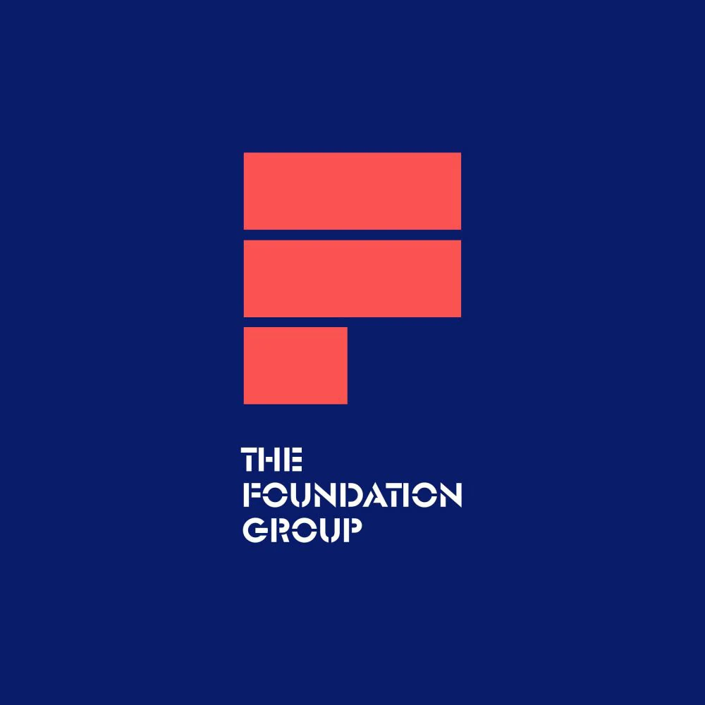
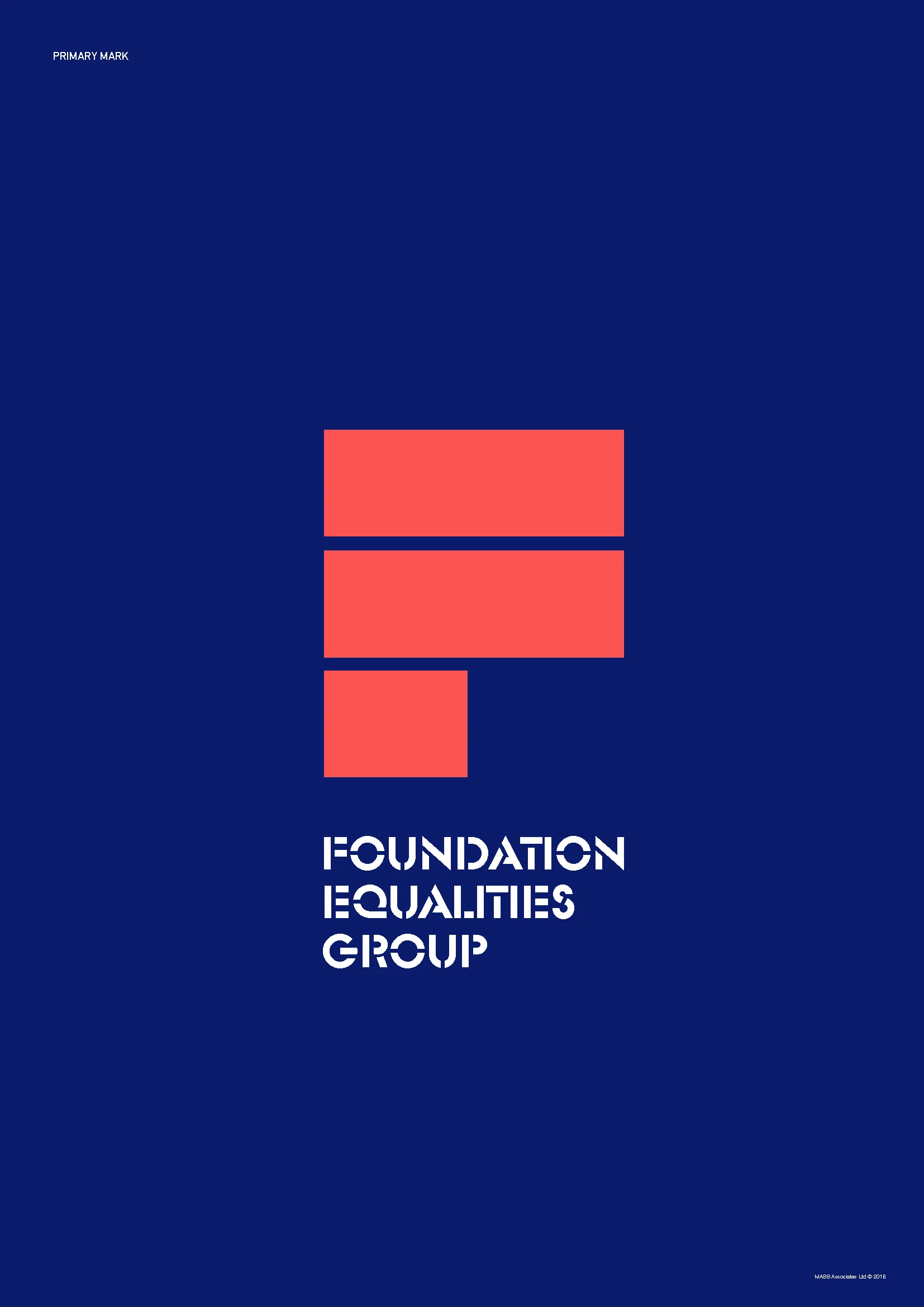
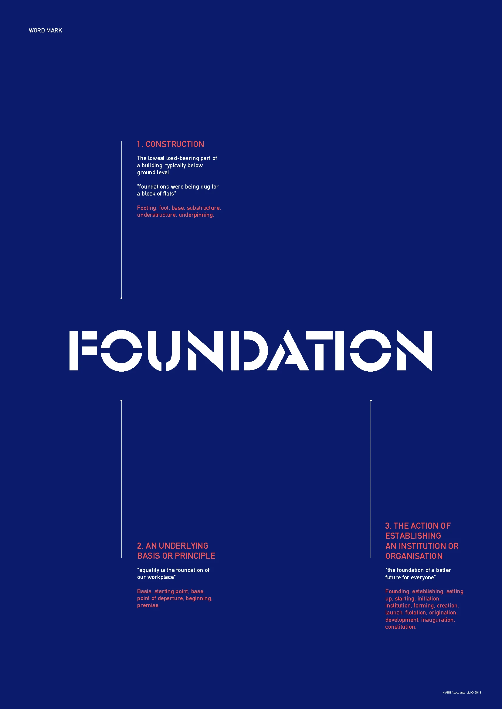
MASS created the name Foundation.
It was deliberately gender neutral, giving the group an identity that did not define itself around one gender or another.
The name also carried a natural connection with Seddon’s world.
A foundation is where something begins.
It provides the structure on which something stronger can be built.
That gave the initiative a simple underlying idea:
lasting change starts with strong foundations.
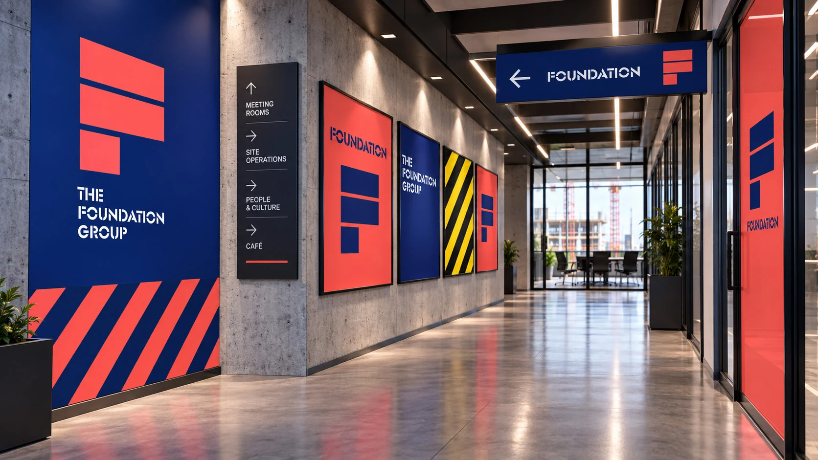
From there, MASS developed a confident visual identity that could give the initiative presence and help its supporters communicate a clear message around equality and diversity.
The Work
From a name into a complete identity system.
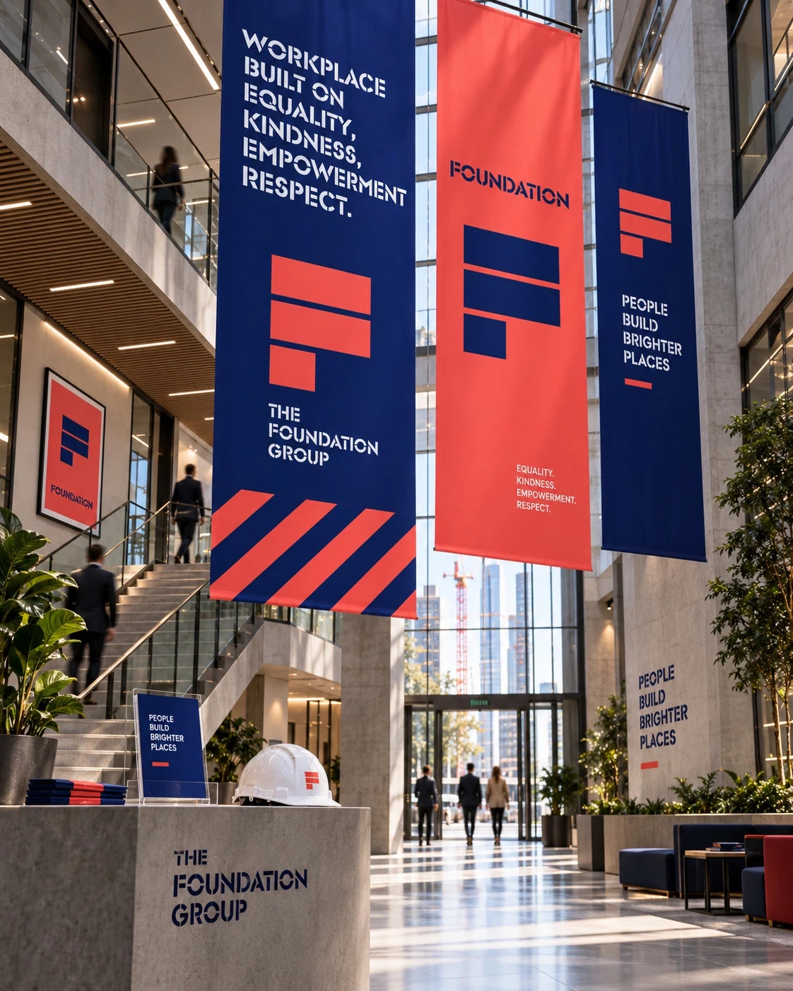
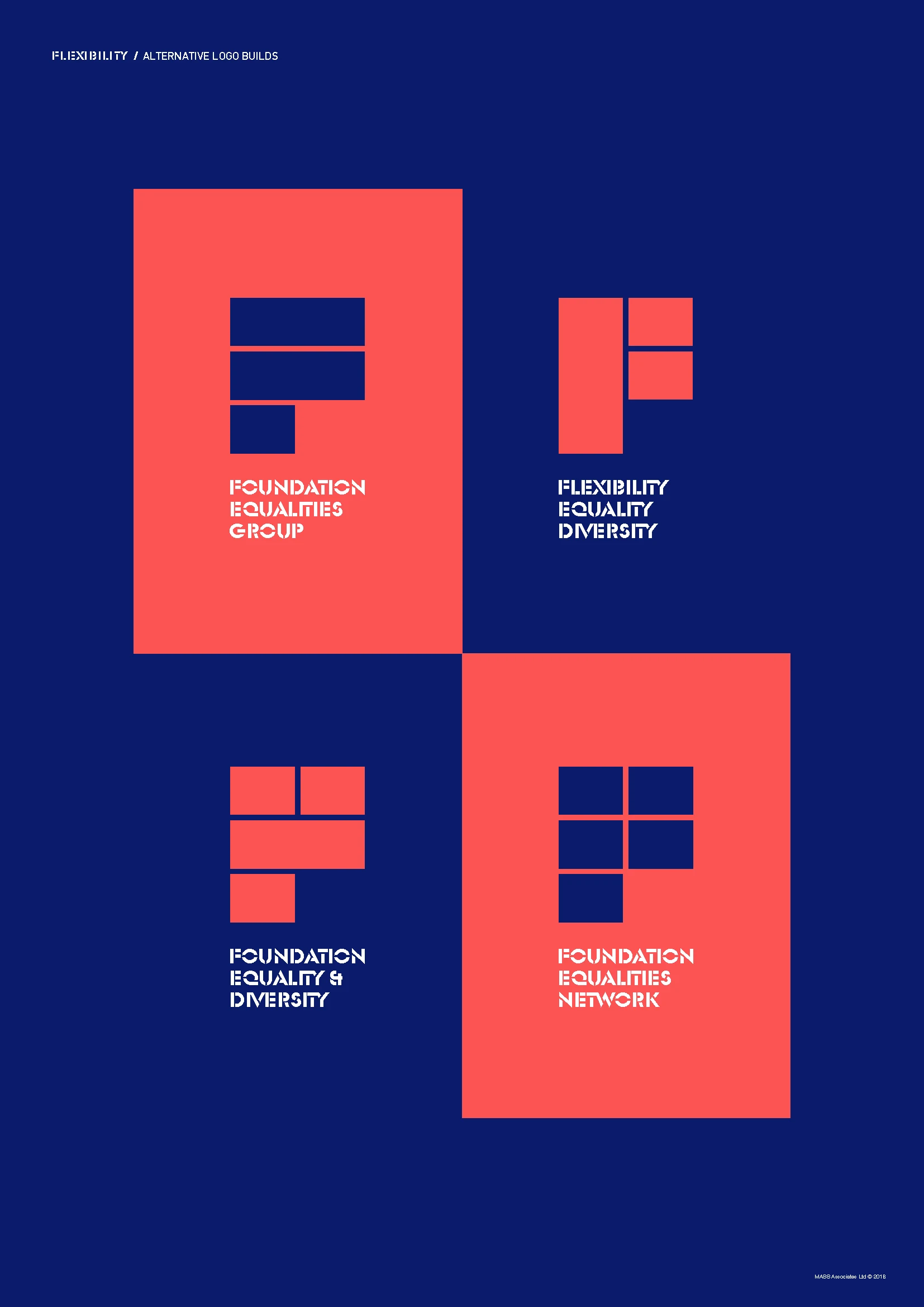
MASS developed Foundation beyond the initial naming idea into a wider brand system.
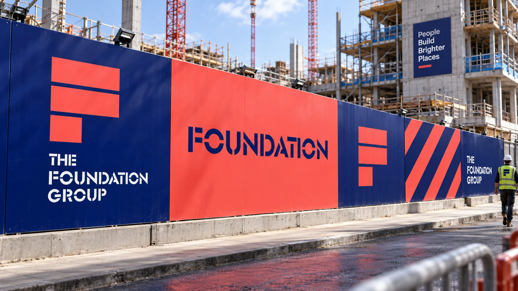
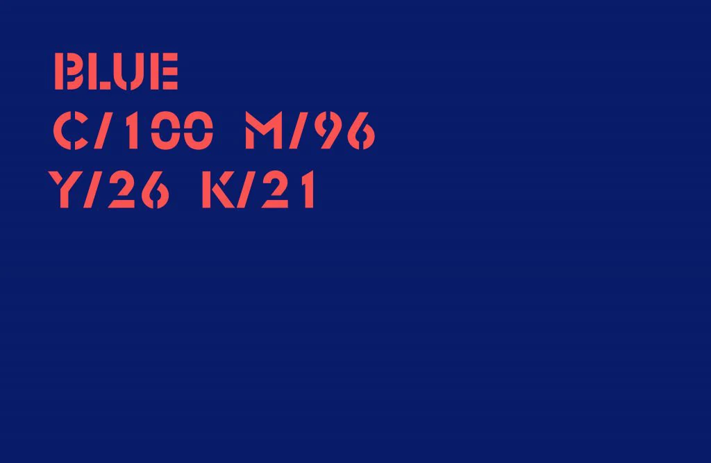
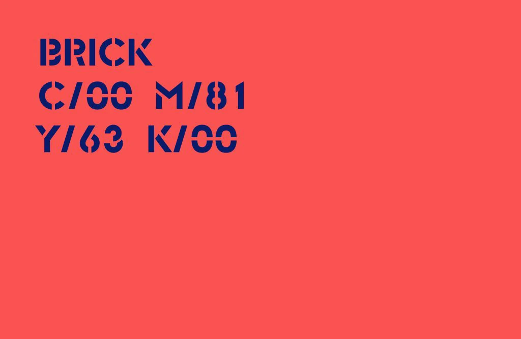
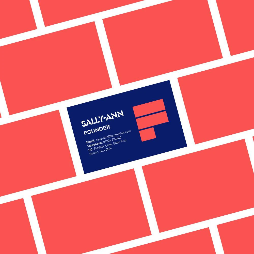
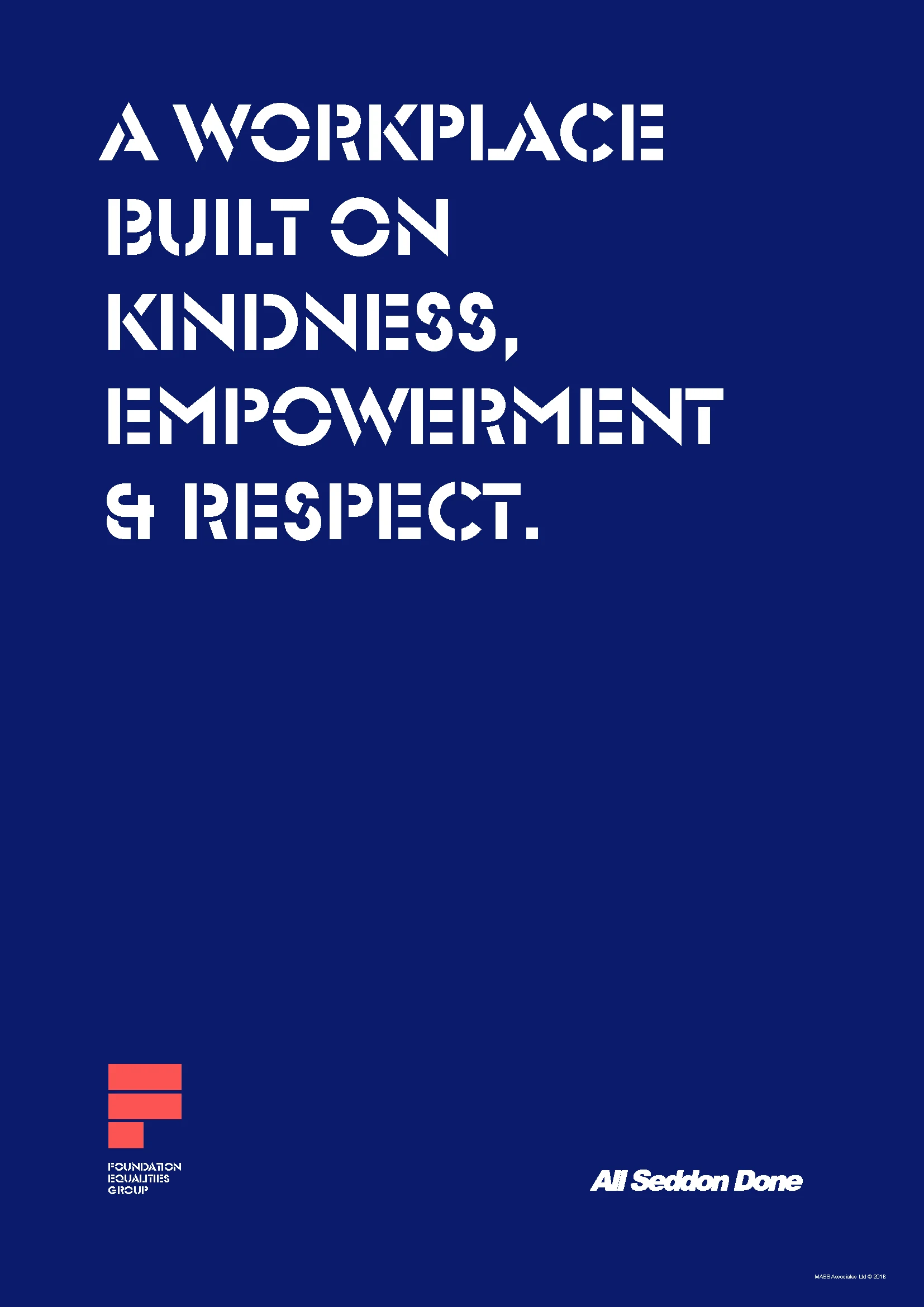
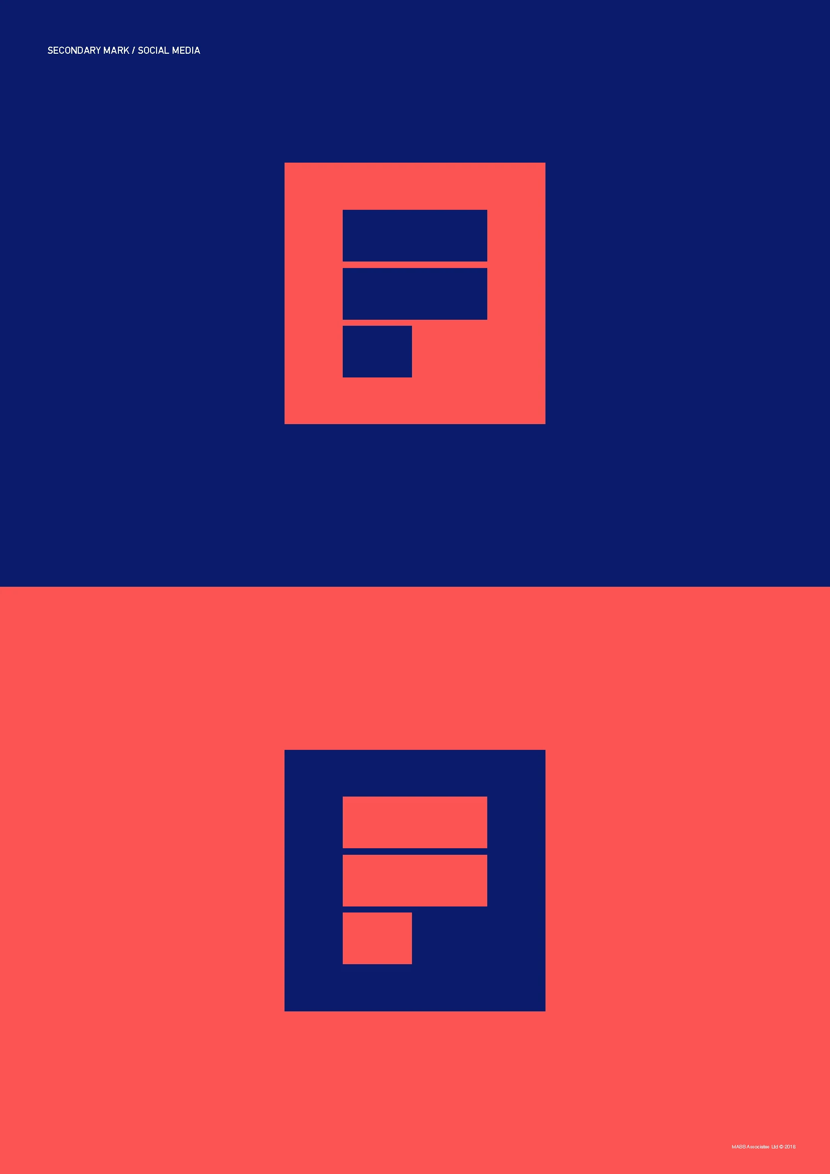
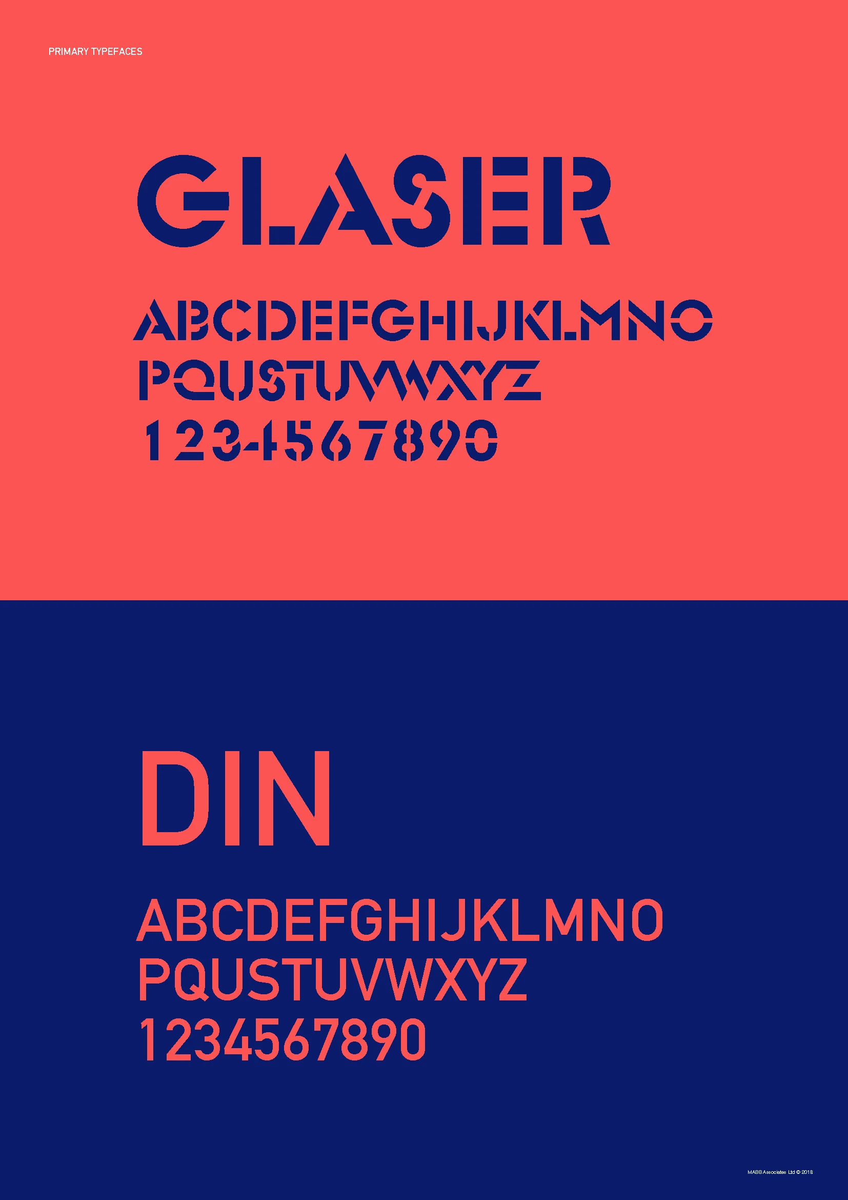
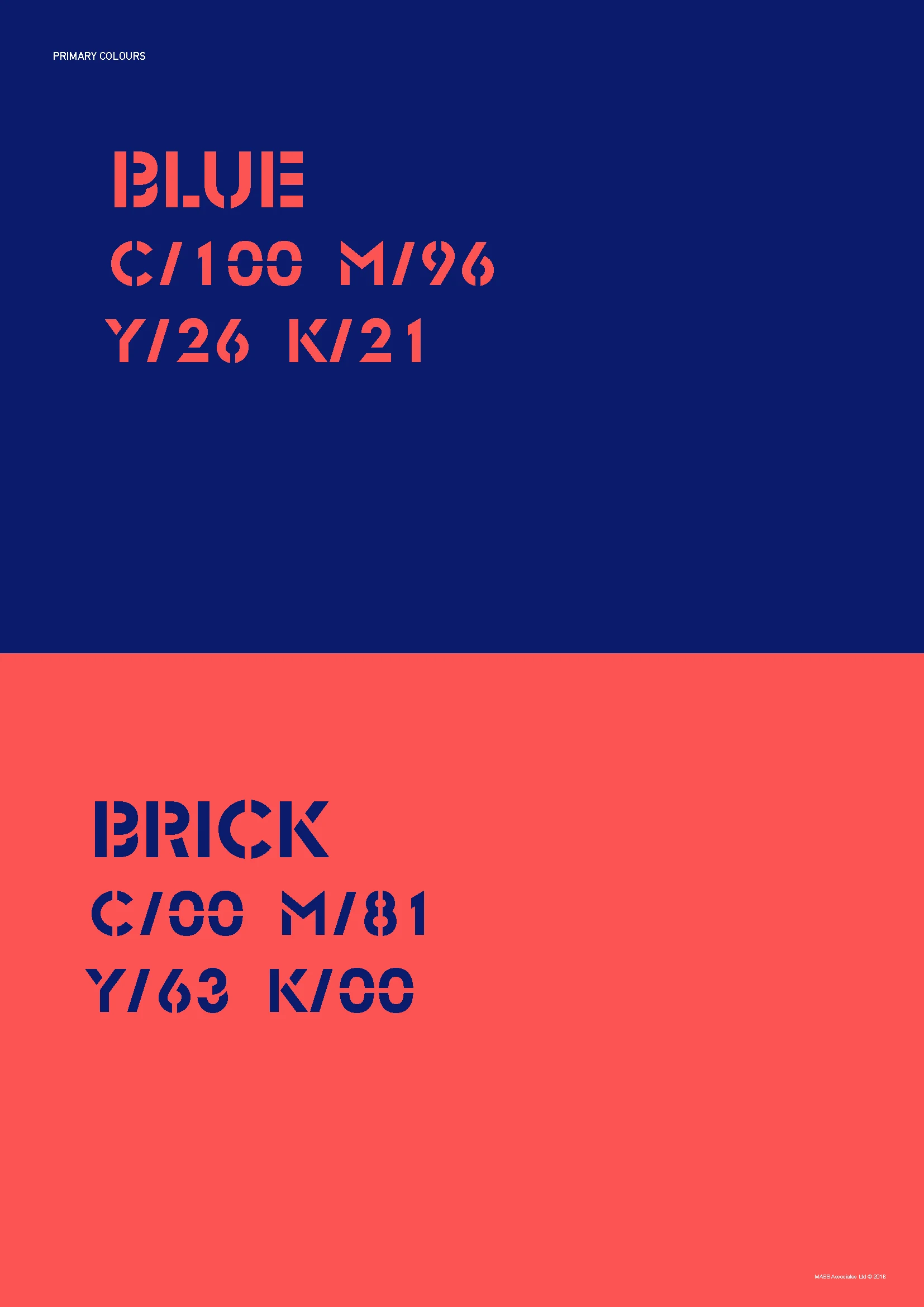
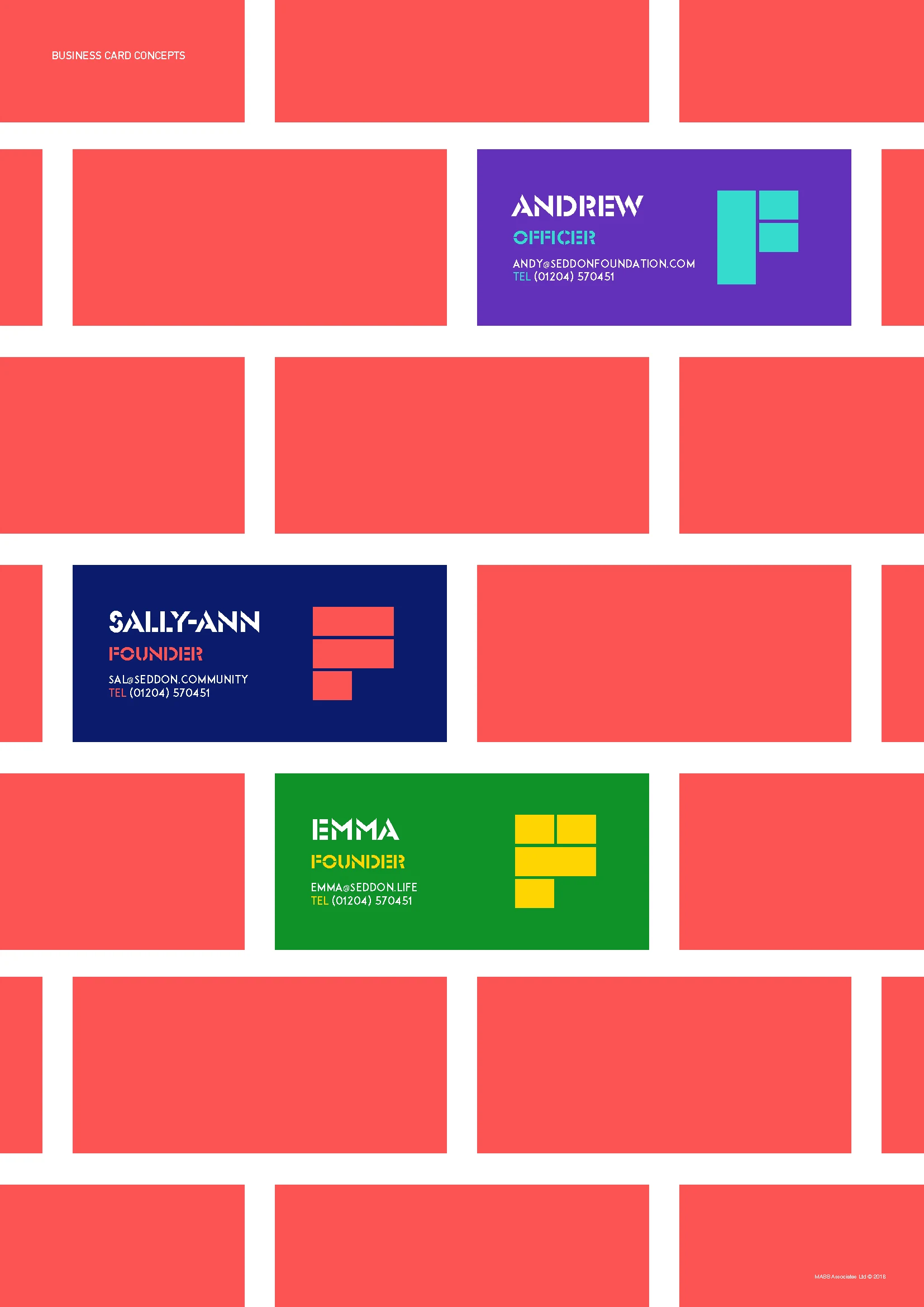
The recovered project included the primary identity, word mark, mission statement, colour system, business cards, social media applications and animated digital assets.
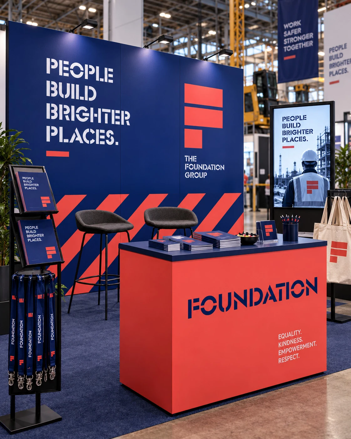
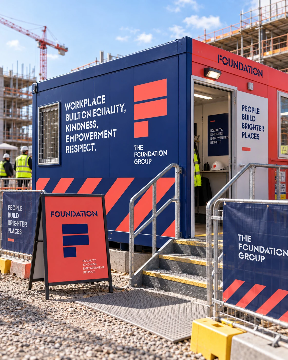
The identity was designed to feel contemporary and distinctive, giving Foundation enough visual strength to operate as a recognisable initiative across different communications.
The system could move between physical and digital applications while maintaining a consistent voice and purpose.
How It Worked
An identity designed to support a movement, not simply label it.
Foundation needed to do more than put a logo on an internal initiative.
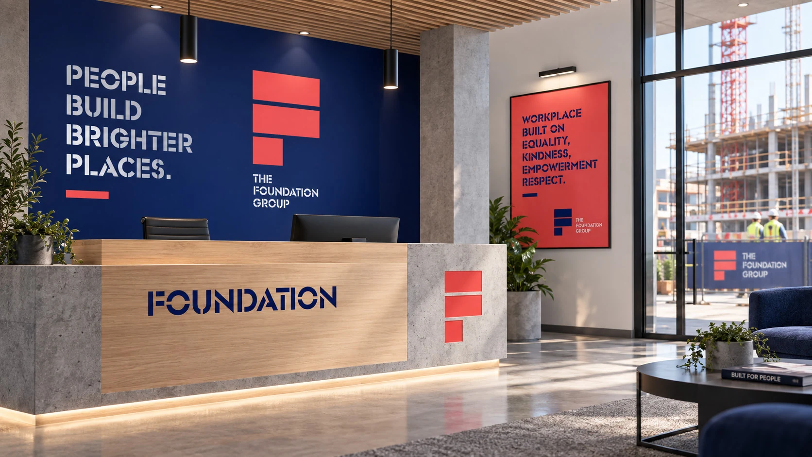
The name, messaging and visual system worked together to give the group something people could identify with.
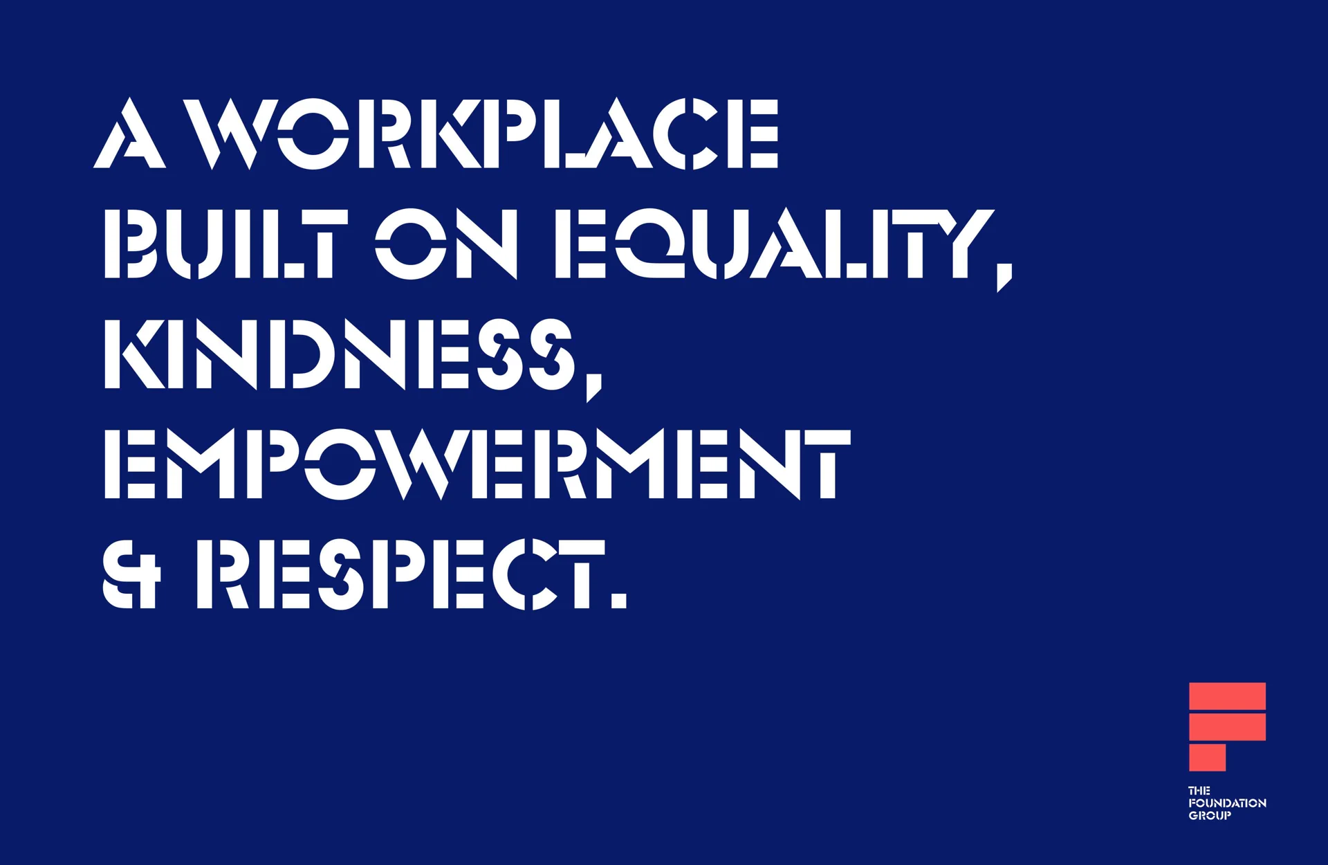
The mission statement helped articulate its purpose.
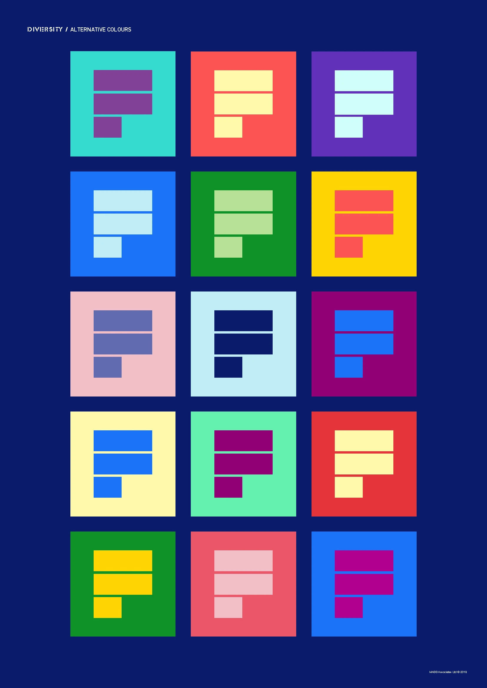
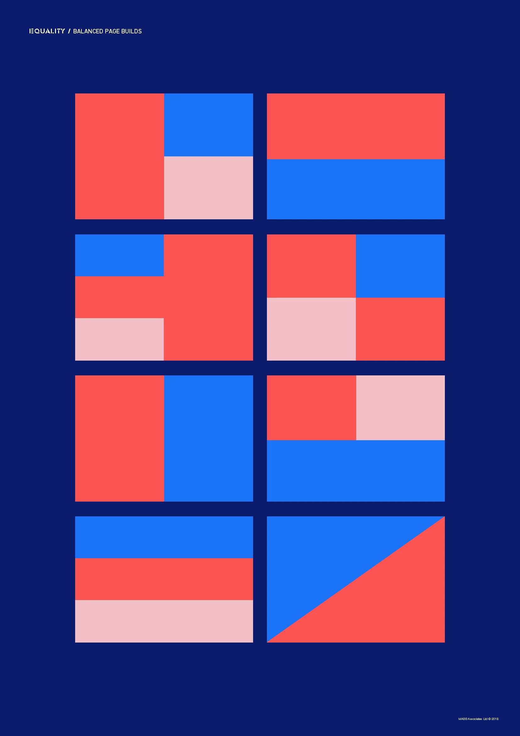
The colour and identity system created recognition.
Social and motion assets gave the brand flexibility beyond printed communications.
Together, those elements created a platform that could support Foundation as the initiative developed.
The Result
A clear identity for a shared purpose.
MASS gave Seddon’s gender equality group a name and visual identity capable of standing on its own.
Foundation provided a gender neutral platform from which supporters could campaign for greater equality and diversity within the workplace, the local community and the wider region.
Rather than defining the initiative through gender stereotypes, the identity focused on the more important idea behind it:
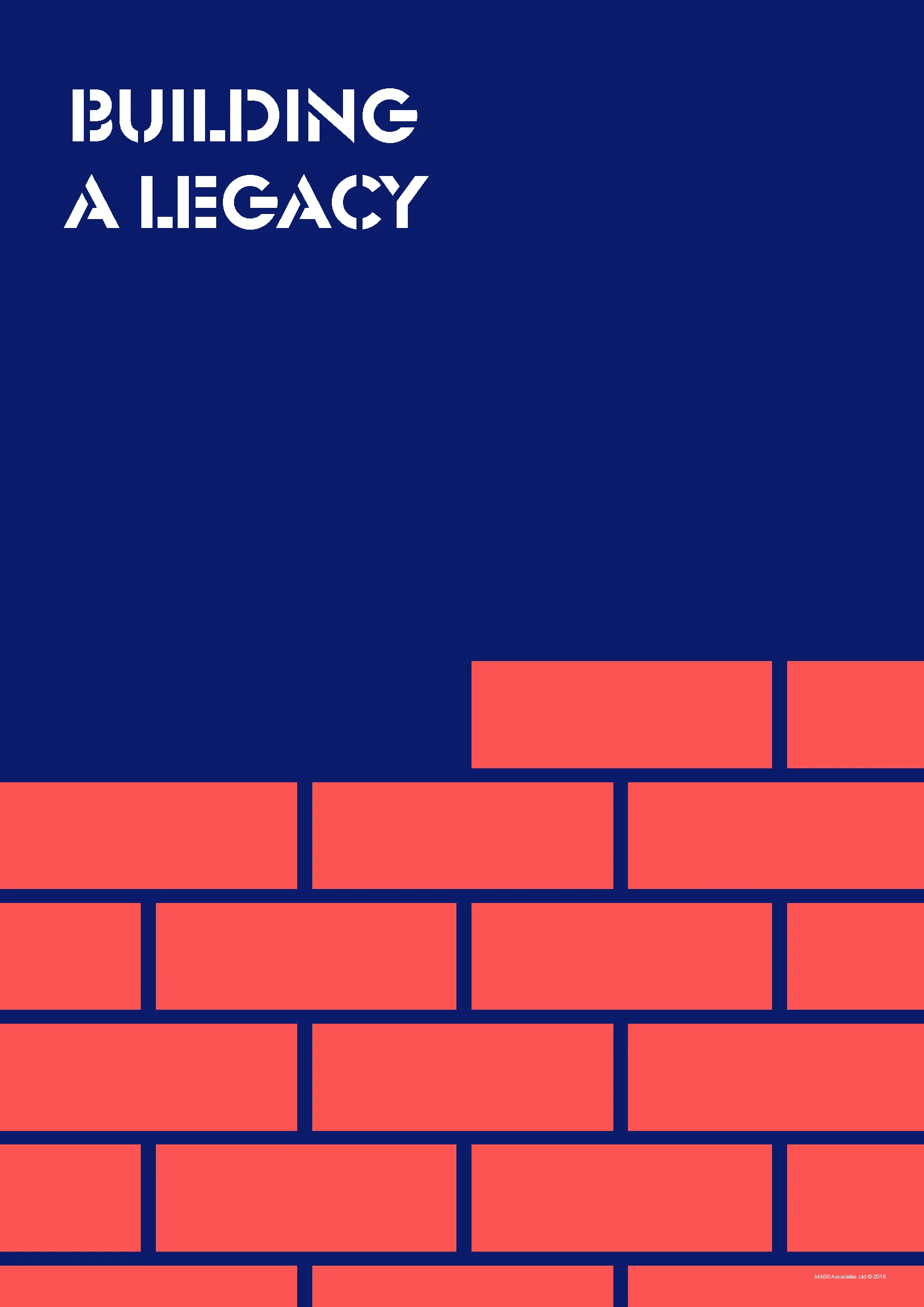
building the conditions for positive change.



Why It Matters
Brand thinking can help internal ideas become shared ideas.
Not every identity is created for customers.
Sometimes the audience is the organisation itself.
Foundation demonstrates how naming, design and communication can help give an internal initiative clarity, credibility and momentum.
The project required:
brand naming, strategic thinking, sensitive communication, identity development, digital application, and motion.
For MASS, it demonstrates the ability to take a complex internal brief and turn it into something simple, inclusive and usable.
Understand the purpose. Remove the stereotypes. Create something people can belong to. Build from there.
The Proof
NAMING + IDENTITY Foundation created from the ground up.
GENDER NEUTRAL Designed around inclusion rather than stereotypes.
PRINT + DIGITAL Identity applied across physical and social communications.
MOTION + SOCIAL Animated and digital assets extending the brand system.