MASS

Active Aquatics swimming brand identity

CASE STUDIESACTIVE AQUATICSActiveAquaticsMaking waves for a new generation of swimmers.ClientSefton Council, Active AquaticsProjectMASS developed the creative direction and visual identity, carrying the rebrand through to finished print and digital materials. The work combined brand development with the practical design needed to put the identity into use.Mass Role· Creative Direction· Brand Development· Visual Identity· Illustration· Typography· Print & Digital DesignDelivery· Logo· Custom Typeface· Illustrated Brand Assets· Campaign Advertising· Brochure· Posters· Roller Banner· Digital MaterialsThe ContextThree leisure sites. One opportunity to make a bigger splash.Sefton Council provided junior swimming lessons across three leisure sites, helping children take their first steps into the water and develop their swimming skills.The programme needed an identity that would connect with children and the adults choosing lessons for them.Active Aquatics gave MASS the opportunity to bring personality and recognition to that offer: a brand that could capture the enjoyment of swimming and work consistently across the materials families encountered online and in their local leisure centre.The ChallengeMake swimming feel inviting before anyone reaches the pool.The identity had to appeal to two audiences.For children, it needed to feel playful, friendly and full of energy. For parents and carers, the communications needed to make the programme easy to recognise and understand.That balance had to hold across very different formats, from a poster catching someone’s attention to a brochure explaining the offer.The challenge was to establish a distinctive creative direction and make it work in practice, with each application suited to its purpose and recognisably part of the same brand.The IdeaGive learning to swim a personality of its own.MASS built the identity around a bold new logo, illustrations designed to appeal to children and a custom typeface.Together, these elements gave Active Aquatics its own visual character.The illustrations brought a friendly, playful quality to the communications. The bespoke typography carried that personality into the wording, while the logo provided a recognisable anchor across the different materials.These elements formed the basis of a coordinated identity, giving the programme a consistent appearance while allowing flexibility in how each piece of communication was designed.The WorkCreative direction carried through to finished communications.MASS developed the rebrand and applied it across campaign advertising, a brochure, posters, a roller banner and digital materials.Each format had a different job to do.Advertising and posters needed an immediate visual presence. The brochure gave the programme room to explain its offer. The roller banner brought the identity into the leisure environment, while digital materials extended it onto screens.The design work involved adapting the layout, typography and illustration to each format while retaining the character of the overall identity.This connected the initial brand thinking with the everyday materials Sefton Council needed to promote the programme.The ResultA distinctive swimming brand with the materials to support it.Active Aquatics gained a complete identity and a coordinated suite of communications for Sefton Council’s junior swimming programme.The new brand was used across print and digital, giving the programme a stronger visual presence and a consistent way to present its lessons.For an offer spanning three leisure sites, the shared logo, illustration and typography provided a common visual foundation across its promotional materials.The result was a rebrand supported by finished applications that showed how the identity worked in use.Why It MattersA brand earns its value through the way it is used.Active Aquatics demonstrates the connection between creative direction and practical delivery.The work required an understanding of the audience, the development of a distinctive identity and the design judgement to carry it across different formats.That combination matters to organisations communicating through multiple channels or locations. Every piece needs to serve its own purpose while contributing to a recognisable overall brand.For MASS, the responsibility runs from shaping the initial idea through to the quality and consistency of the finished work.The OutcomeOne recognisable brand across a programme spanning three leisure sites.The rebrand gave Sefton Council a distinctive identity and a coordinated range of print and digital materials to promote its junior swimming lessons.The new logo, illustrations and custom typography connected the advertising, brochure, posters and display materials. Active Aquatics now had a consistent visual identity that could carry through from a family’s first encounter with the programme to the communications they saw at their local leisure centre.Client Response“Harvey understood that the identity needed to appeal to children while communicating clearly with parents. He brought real personality to Active Aquatics and carried that thinking through all the materials we needed to promote the programme. Everything felt connected, from the logo and illustrations to the brochures and posters. It gave us a distinctive brand we could put to work.”Ste CushionDevelopment Manager (Health & Wellbeing)The Proof 3 LEISURE SITESJunior swimming provision across Sefton.FULL REBRANDA new logo and illustrated visual identity.CUSTOM TYPEFACEDistinctive typography developed for the brand.PRINT & DIGITALCreative direction carried across a coordinated range of finished materials.
Active Aquatics project artwork

CASE STUDIES ACTIVE AQUATICS
Active Aquatics project artwork

Active Aquatics

Making waves for a new generation of swimmers.
Active Aquatics project artwork

Client

Sefton Council, Active Aquatics

Project

MASS developed the creative direction and visual identity, carrying the rebrand through to finished print and digital materials. The work combined brand development with the practical design needed to put the identity into use.

Mass Role
Active Aquatics project artwork

· Creative Direction · Brand Development · Visual Identity · Illustration · Typography · Print & Digital Design

Delivery

· Logo · Custom Typeface · Illustrated Brand Assets · Campaign Advertising · Brochure · Posters · Roller Banner · Digital Materials
Active Aquatics project artwork

The Context

Three leisure sites. One opportunity to make a bigger splash.

Sefton Council provided junior swimming lessons across three leisure sites, helping children take their first steps into the water and develop their swimming skills.

The programme needed an identity that would connect with children and the adults choosing lessons for them.

Active Aquatics gave MASS the opportunity to bring personality and recognition to that offer: a brand that could capture the enjoyment of swimming and work consistently across the materials families encountered online and in their local leisure centre.
Active Aquatics project artwork

The Challenge

Make swimming feel inviting before anyone reaches the pool.

The identity had to appeal to two audiences.

For children, it needed to feel playful, friendly and full of energy. For parents and carers, the communications needed to make the programme easy to recognise and understand.

That balance had to hold across very different formats, from a poster catching someone’s attention to a brochure explaining the offer.

The challenge was to establish a distinctive creative direction and make it work in practice, with each application suited to its purpose and recognisably part of the same brand.
Active Aquatics project artwork

The Idea

Give learning to swim a personality of its own.

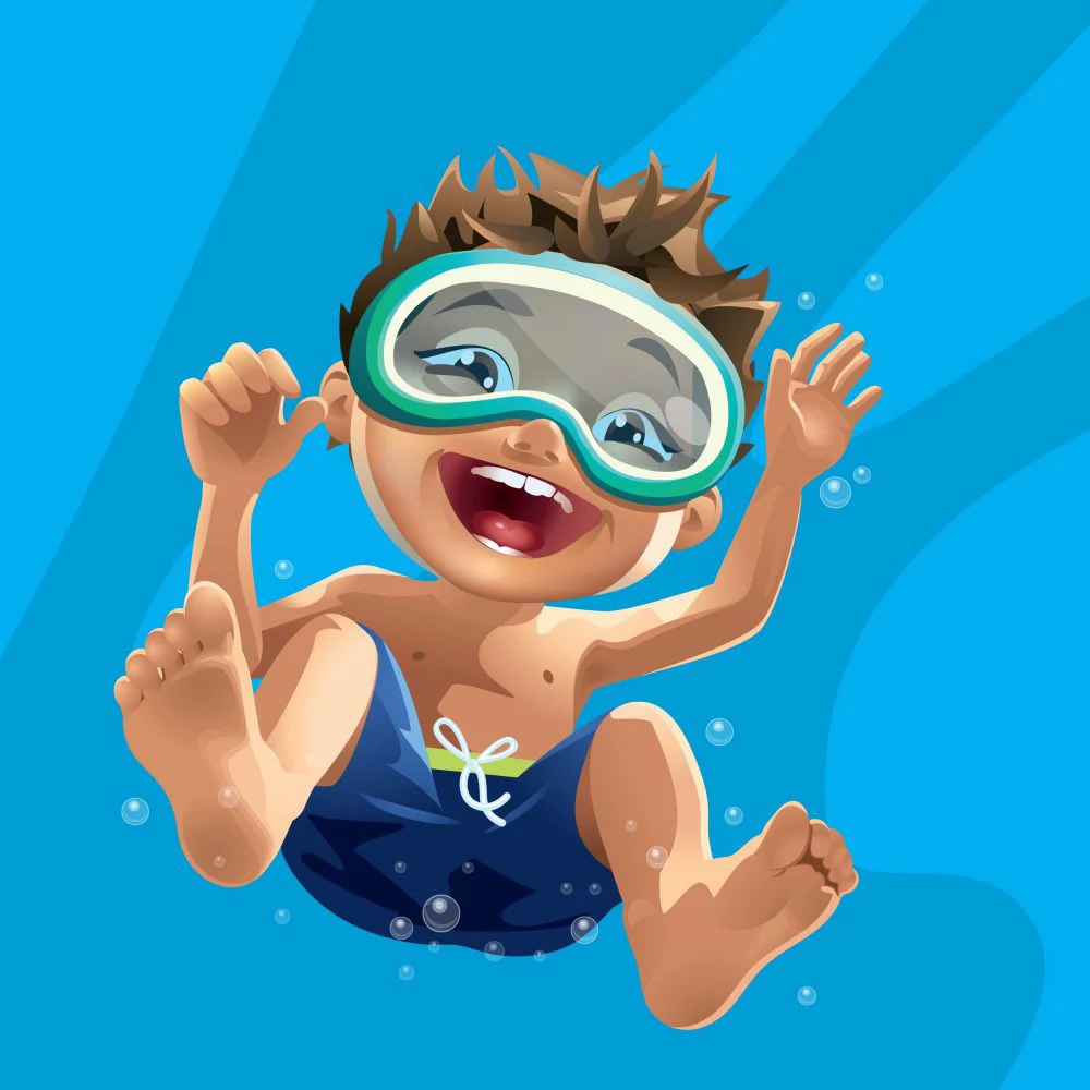
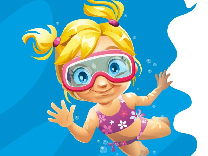
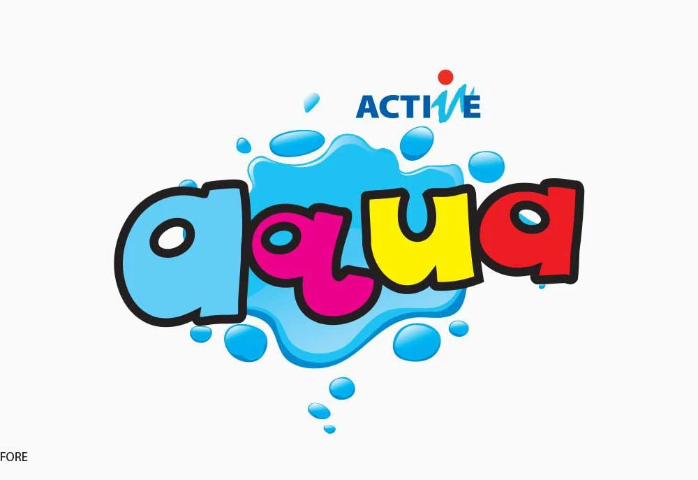
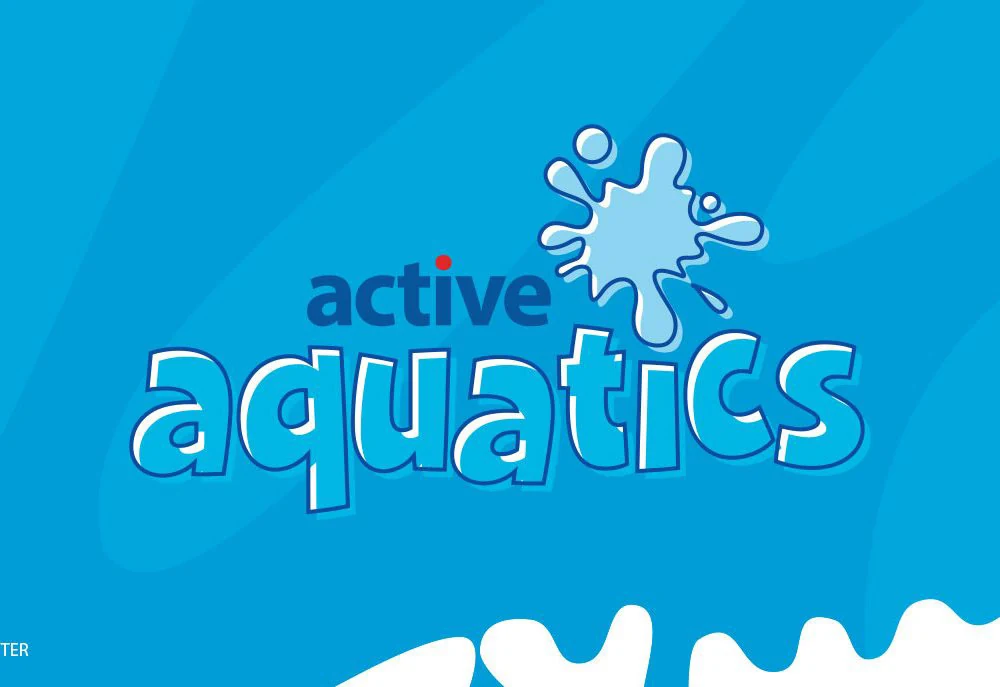
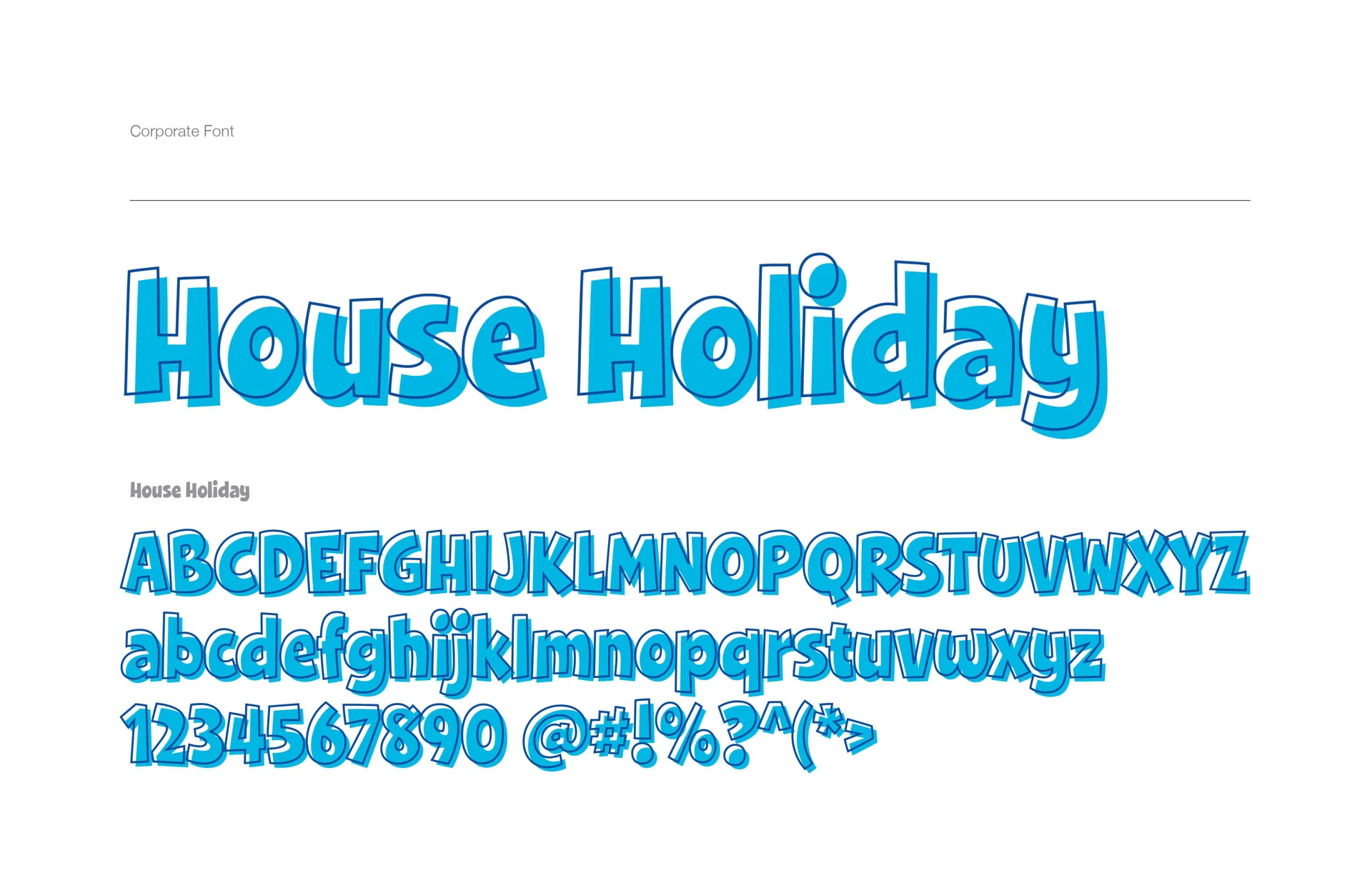
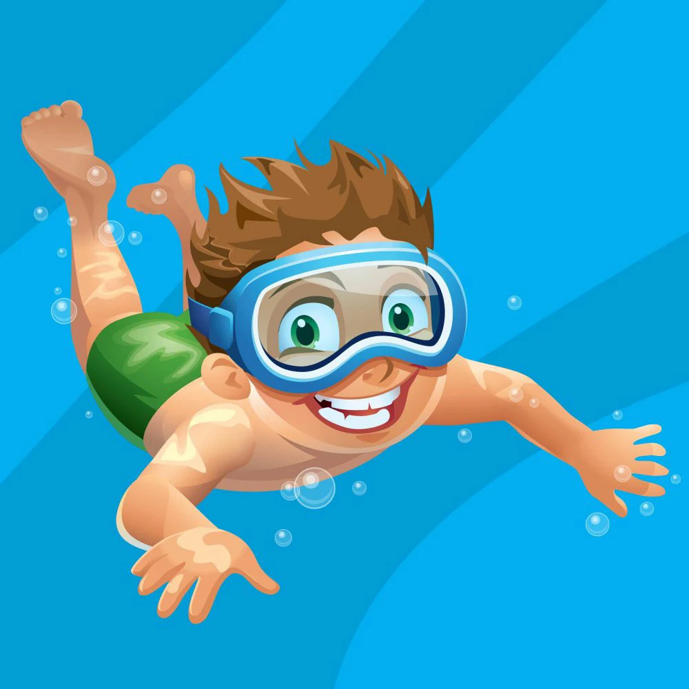
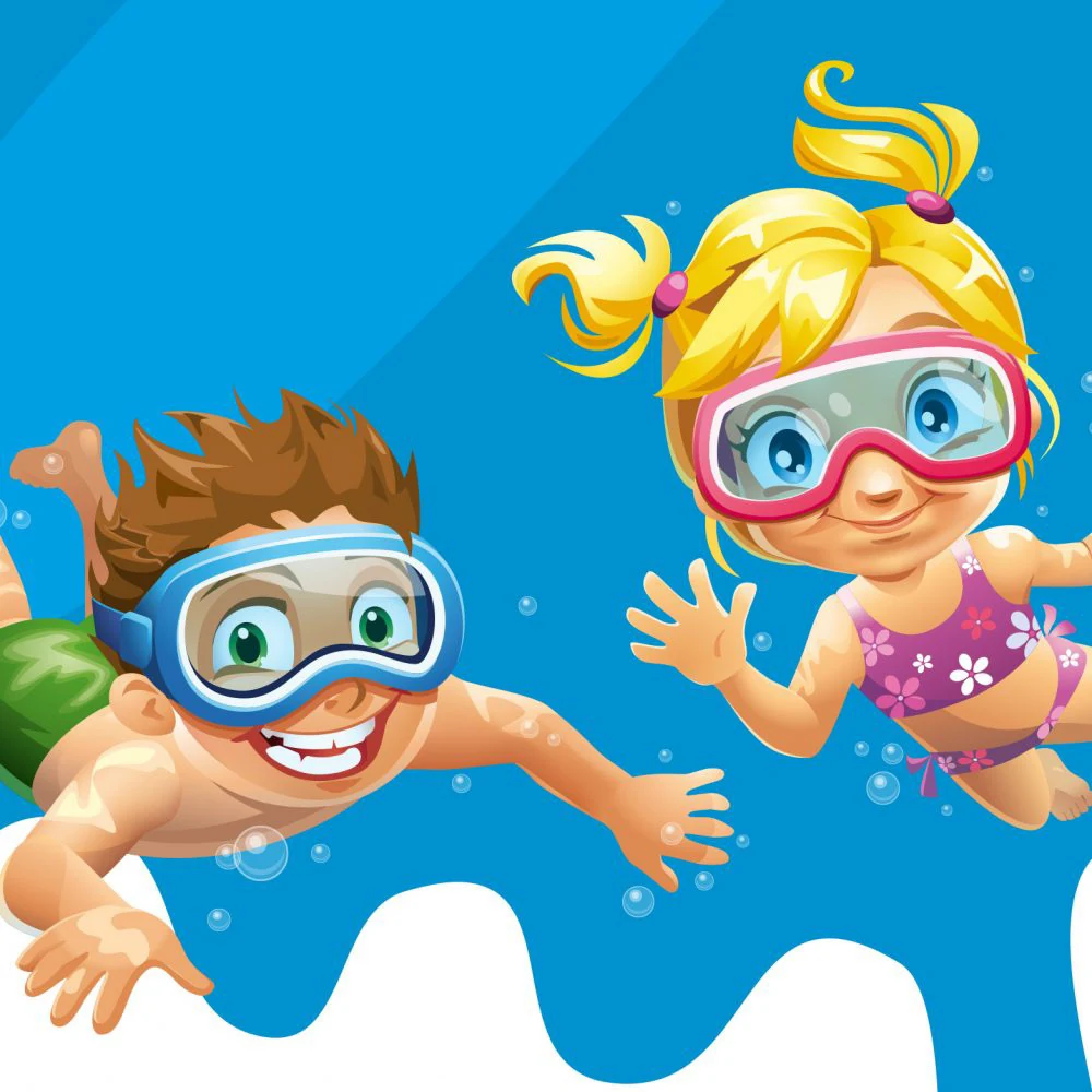
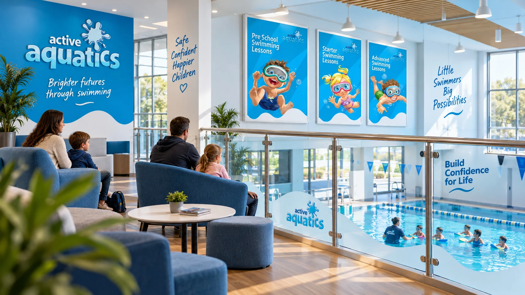
MASS built the identity around a bold new logo, illustrations designed to appeal to children and a custom typeface.

Together, these elements gave Active Aquatics its own visual character.

The illustrations brought a friendly, playful quality to the communications. The bespoke typography carried that personality into the wording, while the logo provided a recognisable anchor across the different materials.

These elements formed the basis of a coordinated identity, giving the programme a consistent appearance while allowing flexibility in how each piece of communication was designed.
Active Aquatics project artwork

The Work

Creative direction carried through to finished communications.

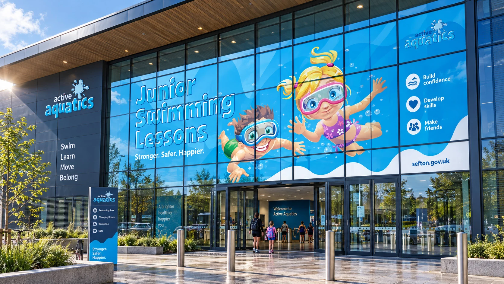
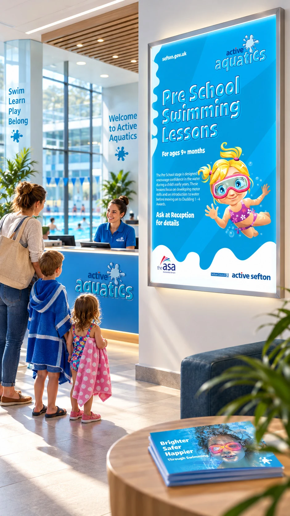
MASS developed the rebrand and applied it across campaign advertising, a brochure, posters, a roller banner and digital materials.

Each format had a different job to do.

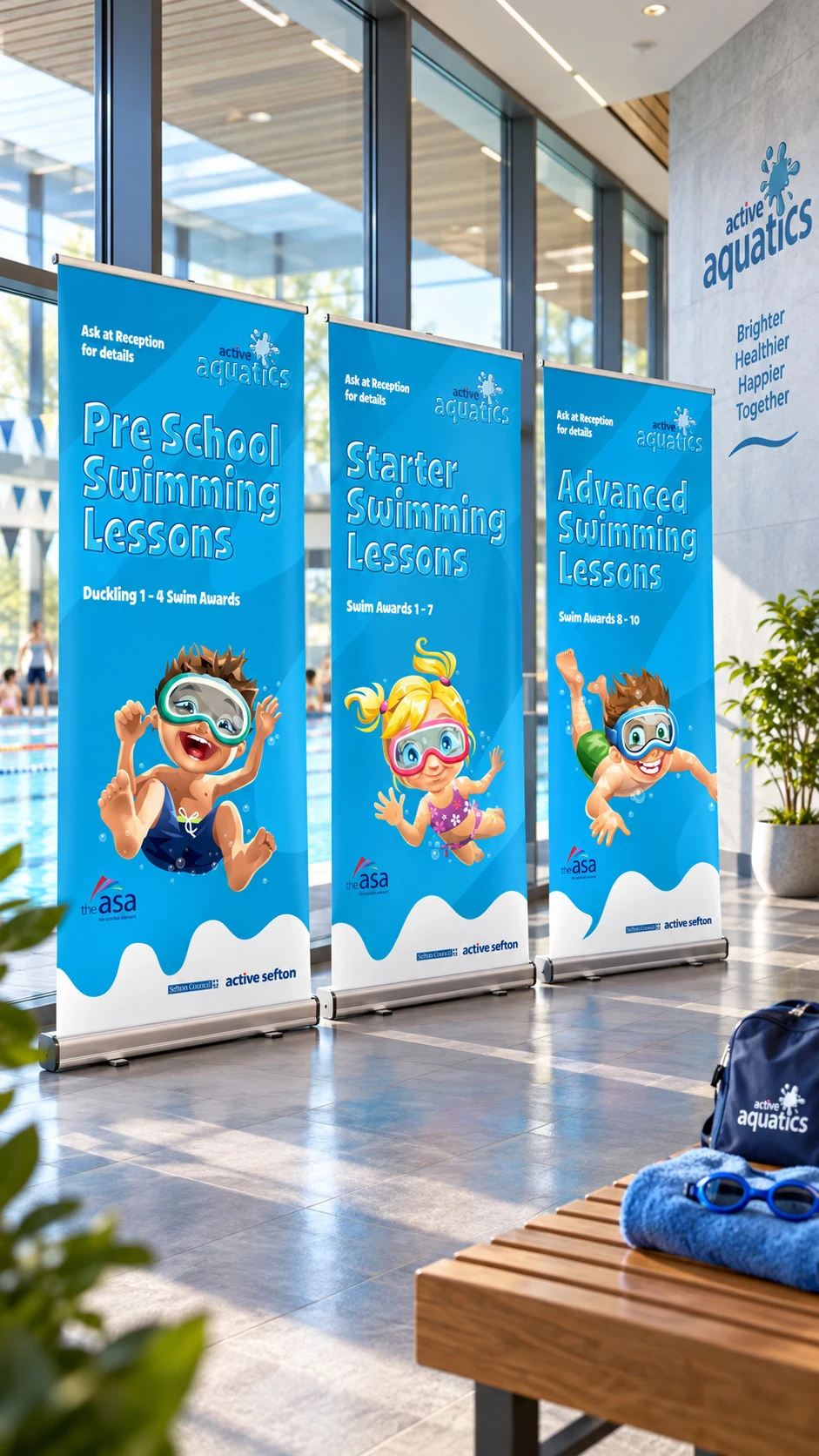
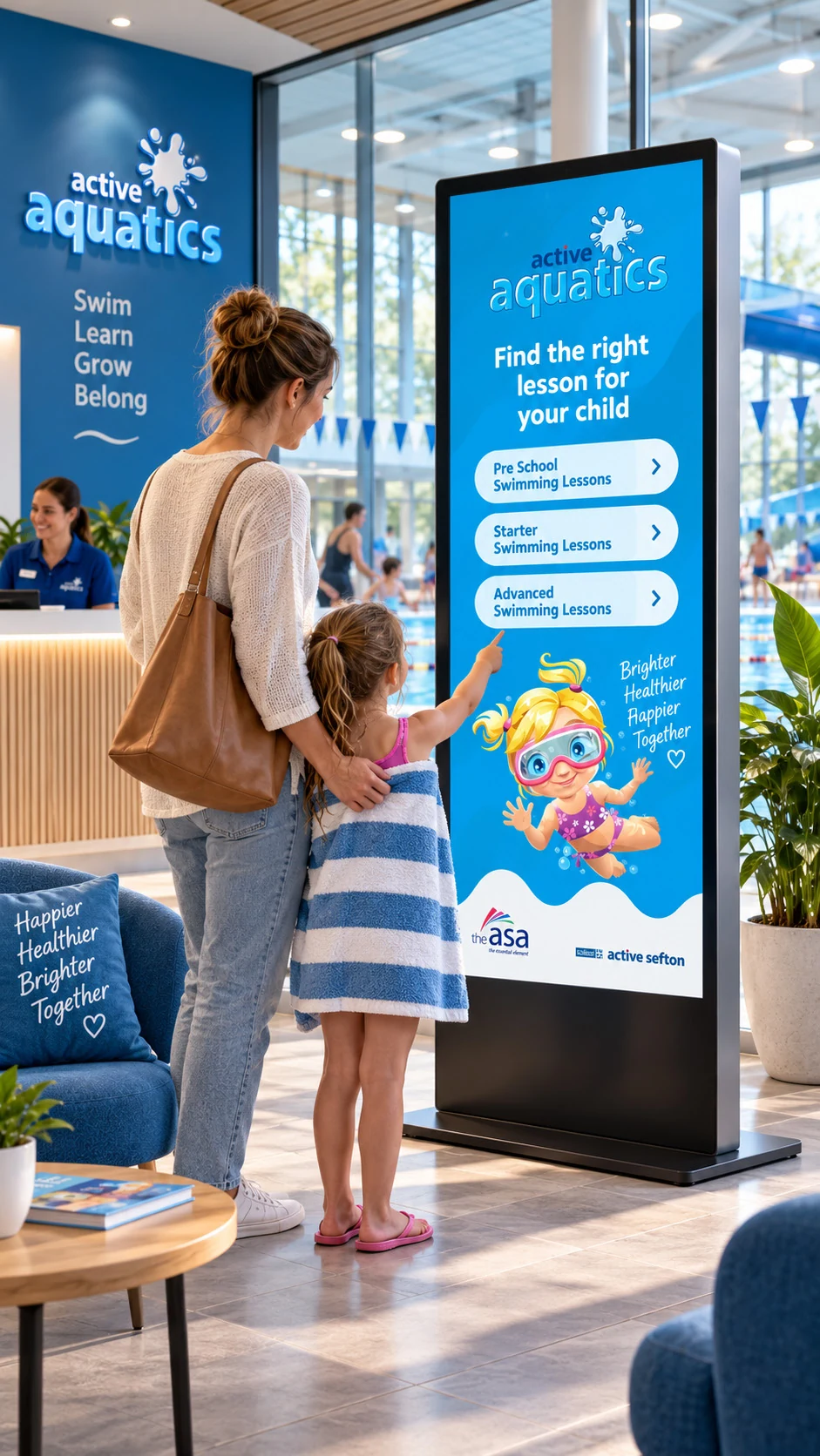
Advertising and posters needed an immediate visual presence. The brochure gave the programme room to explain its offer. The roller banner brought the identity into the leisure environment, while digital materials extended it onto screens.

The design work involved adapting the layout, typography and illustration to each format while retaining the character of the overall identity.
Active Aquatics project artwork

This connected the initial brand thinking with the everyday materials Sefton Council needed to promote the programme.

The Result

A distinctive swimming brand with the materials to support it.

Active Aquatics gained a complete identity and a coordinated suite of communications for Sefton Council’s junior swimming programme.

The new brand was used across print and digital, giving the programme a stronger visual presence and a consistent way to present its lessons.

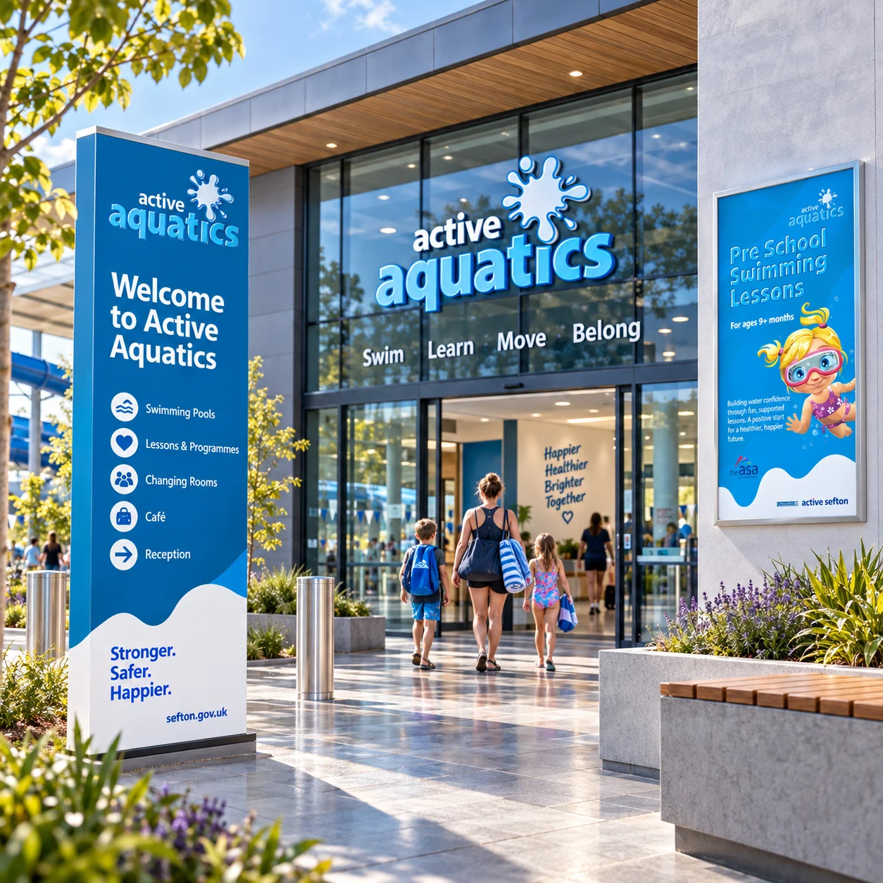
For an offer spanning three leisure sites, the shared logo, illustration and typography provided a common visual foundation across its promotional materials.

The result was a rebrand supported by finished applications that showed how the identity worked in use.
Active Aquatics project artwork

Why It Matters

A brand earns its value through the way it is used.

Active Aquatics demonstrates the connection between creative direction and practical delivery.

The work required an understanding of the audience, the development of a distinctive identity and the design judgement to carry it across different formats.

That combination matters to organisations communicating through multiple channels or locations. Every piece needs to serve its own purpose while contributing to a recognisable overall brand.

For MASS, the responsibility runs from shaping the initial idea through to the quality and consistency of the finished work.
Active Aquatics project artwork

The Outcome

One recognisable brand across a programme spanning three leisure sites.

The rebrand gave Sefton Council a distinctive identity and a coordinated range of print and digital materials to promote its junior swimming lessons.

The new logo, illustrations and custom typography connected the advertising, brochure, posters and display materials. Active Aquatics now had a consistent visual identity that could carry through from a family’s first encounter with the programme to the communications they saw at their local leisure centre.

Client Response

“Harvey understood that the identity needed to appeal to children while communicating clearly with parents. He brought real personality to Active Aquatics and carried that thinking through all the materials we needed to promote the programme. Everything felt connected, from the logo and illustrations to the brochures and posters. It gave us a distinctive brand we could put to work.”

Ste Cushion Development Manager (Health & Wellbeing)

The Proof

3 LEISURE SITES Junior swimming provision across Sefton.

FULL REBRAND A new logo and illustrated visual identity.

CUSTOM TYPEFACE Distinctive typography developed for the brand.

PRINT & DIGITAL Creative direction carried across a coordinated range of finished materials.